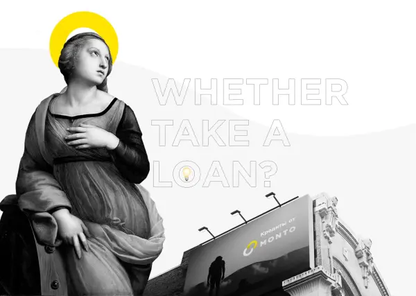
Branding of online loan service Monto
When the client approached us, they were planning to launch an online lending service but were still searching for a name. The main goal was to increase retention and LTV. We understood that branding development for an online lending service should start with deep meaning, so that the website would be memorable and users would keep coming back.
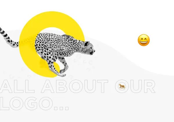
Comprehensive branding for Monto allowed us to stand out from competitors through unique color coding and a new tone of communication. We chose a sunny yellow color and shifted the focus from primitive sales tactics to care and service. As a result, Monto became not just a financial platform, but a true “friend who is always there,” fundamentally changing the perception of micro-lending.
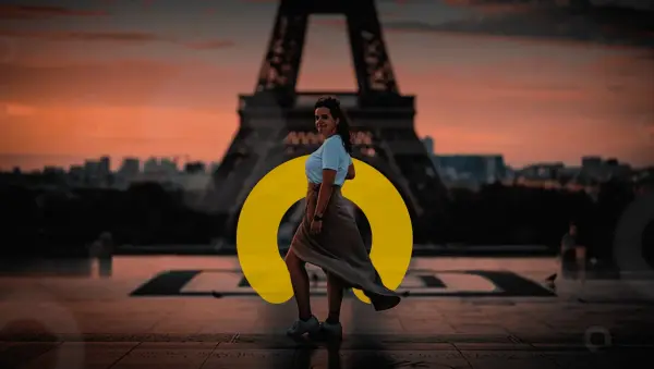
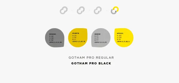
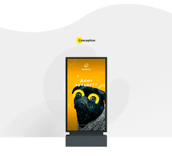
After establishing the communication platform, we moved on to visualization. Professional visual identity development for the financial platform was built around the idea of connection: when someone willing to help appears, Monto is born. The concept of friendship was embodied in a semicircle symbol, which became the foundation of the project’s visual language.
This visual concept for a fintech company allowed us to move away from boring templates. We explored various forms — from abstraction to geometry — but this symbol best conveyed the connection between the client and the surrounding world. Ultimately, we created a modern and emotional image that distinguishes the service from competitors and builds user trust.
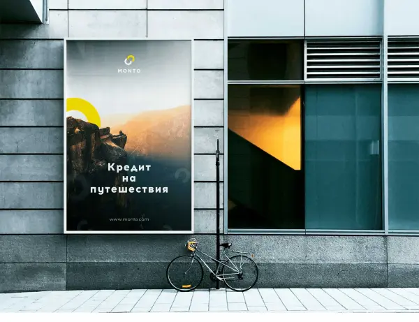
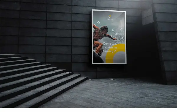
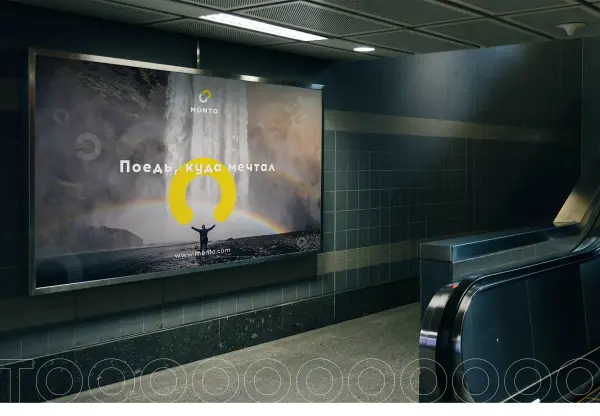
With the logo approved, branding only begins. A well-thought-out visual identity for an online lending platform must cover all channels: from banner networks to printed materials. We defined a communication strategy and created a design code that ensures all advertising creatives remain recognizable, preserving a consistent Monto image in the eyes of users.
Such a comprehensive brand identity for a financial startup allows the brand to remain flexible yet consistent. Even with frequent changes in promotions and offers, the overall concept is instantly recognizable. We developed a system that guarantees users always encounter a familiar service that inspires trust and confidence in the company’s reliability.
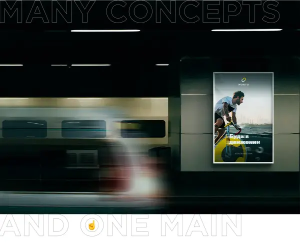
As a bonus for the client, we created several motion animations. This helped visually demonstrate how the fintech brand identity interacts with the digital environment and comes to life within interfaces. Dynamic creatives allow the brand to appear modern and technological, setting the right tone for communication across social media and advertising campaigns.
Such a systematic corporate identity for a fintech startup enables the use of ready-made animation solutions in the future development of the project. We laid the foundation for a visual language where every motion element emphasizes the service’s innovation. As a result, the client received not just a static set of graphics, but a complete toolkit for presenting their product vividly in the digital space.

We have finished working on branding and started designing the lending service interfaces. But that’s another story…


.svg)