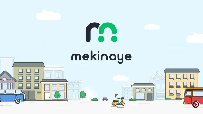
Creating a logo for the car rental and sales service in Ethiopia — Mekinaye
The SOLAR Digital team faced an unusual job — rebranding Ethiopia’s only car sales service. The previous logo had the shape of the 'M' letter. The client desired to keep this letter but make it more stylish. The associations we worked with were wheels and the great love of the Ethiopians for the service.

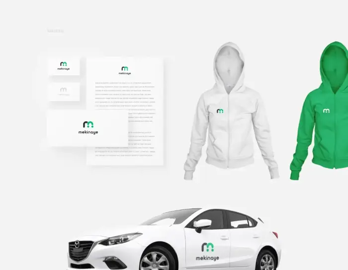
The new logo needed to fit organically into the style of an existing website. To do this, we drew a banner, added a logo, and presented applicability on the web and physical media. We guessed the client’s mood, so the logo was finished on the first try. We had only one version that the whole team and the client appreciated.
For web and video, we also presented the logo animation. We displayed two primary logo meanings: a small car and a positive client in the form of a smile :)
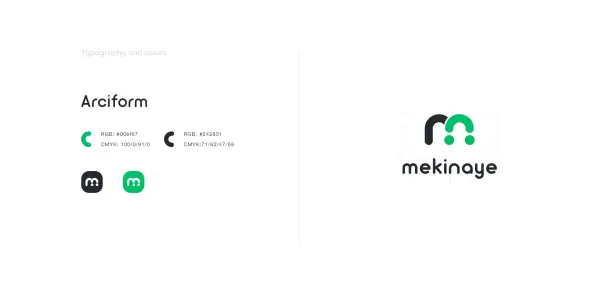
We made a logo for a company in the country that is distinctive in culture and values, so we needed to keep the focus on the company’s origin. To do this, we used the country’s colors: green (see the flag of Ethiopia) and black. Ethiopians are proud of their origins.

And we made a bright pattern recognizable to all residents of Ethiopia.

.svg)