How to combine colors in web design.
Have you ever seen a site or a picture where it was difficult to read the text or see the button? Probably yes! Why is that? Let’s figure it out!
Wrong color combination occurs when designers forget or ignore the rules of the color wheel. A color wheel is a way to display the primary, secondary, and tertiary colors of the light spectrum and all sorts of shades and contrast scales. To better understand, you need to divide the colors into primary, secondary, and tertiary.
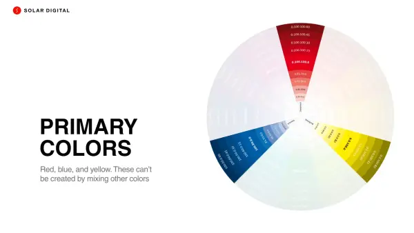
Primary colors. Red, blue, and yellow. These can’t be created by mixing other colors. But they combined to create secondary and tertiary colors.
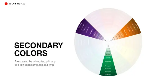
Secondary colors are created by mixing two primary colors in equal amounts at a time. For example: blue + yellow = green.
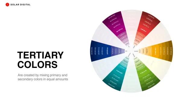
Tertiary colors are created by mixing primary and secondary colors in equal amounts. For example: green + blue = turquoise.
In the web design process, selecting the color scheme is a quite difficult task. In addition to picking colors, you also need to consider how primary, secondary, and tertiary colors will fit together. Here is a quick guide on how to combine colors.
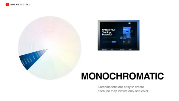
Monochromatic color combinations are easy to create because they involve only one color. This scheme uses different tones from the same angle on the color wheel.
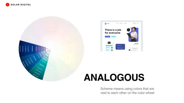
An analogous color scheme means using colors next to each other on the color wheel. Here are a few examples of this color scheme. For example ➔ red, red-orange, and orange.
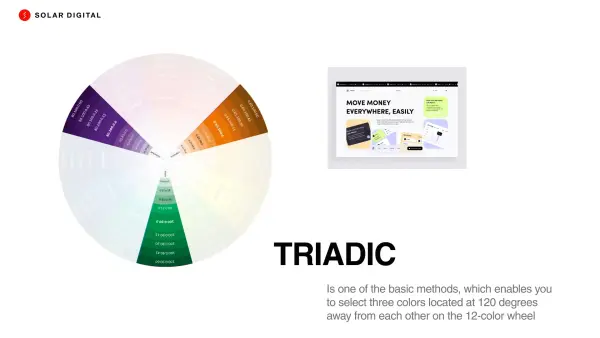
A triadic scheme is one of the main methods, which enables you to select three colors located 120 degrees away from each other on the 12-color wheel.
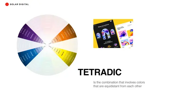
Tetradic is a combination that involves colors equidistant from each other. Put the rectangle on the color wheel and select the colors at each corner.
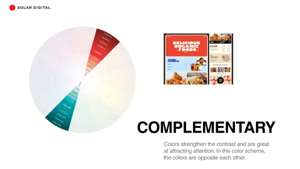
Complementary colors strengthen the contrast and are great at attracting attention. In this color scheme, the colors are opposite each other.
Web design, like any craft, starts with the basics, which will help you be more creative later on. Colors are one of the main tools of designers. Their harmonious combination can evoke emotions and simplify a person’s perception of the presented visual information. Of course, you need to think about comfort and practicality. For example, the text should be readable and understandable. The reader should not strain their eyes. A background that is too colorful can be annoying or cause the user to close the website, even if it is what they were looking for. We hope that you found it interesting and useful.
Check out our cases to see which color schemes our designers have implemented into customers' projects.
Team Solar!