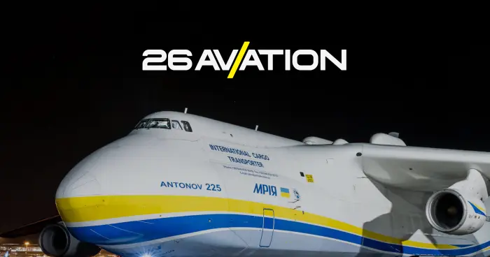
Feel the War: interactive website-chronology of the war in Ukraine
Feel the War is a website with an emotional narrative of events in Ukraine, created to remind the world of the need for support. The development of an interactive website about the war in Ukraine allowed us to convey the scale of the tragedy through visual imagery and sound, helping foreigners feel what is happening without risking their lives.
This multimedia website about military history serves as an important tool for attracting both financial and moral support. The project’s goal is to transform dry statistics into a living experience, creating a strong emotional connection with users and helping preserve historical truth in the global digital space.
Idea
From the first days of the invasion, we actively supported the Armed Forces of Ukraine and volunteers, but we wanted to contribute more on the information front. We came up with the idea of creating a website to document wartime events, turning fragmented news into a unified emotional story. This is how the Feel the War project was born — to show the world what it feels like to be at the epicenter of tragedy.
This web platform development about the war became our way to attract global support. We combined facts and visual evidence into an English-language resource so that any foreigner could feel the reality of what is happening in Ukraine. The project serves not just as an archive, but as a living reminder that the fight for freedom continues every day.

Background
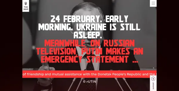
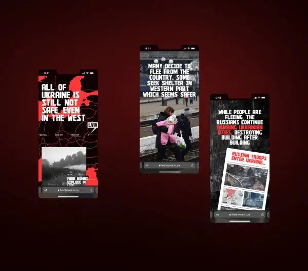
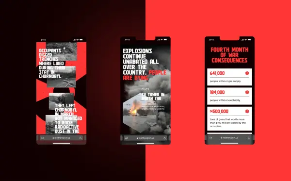
We analyzed a vast amount of news and developed a concept based on visualizing the timeline of the war online. We divided the website pages by months so that visitors could easily find specific dates. At the end of each section, official statistics are added to clearly demonstrate the scale of the tragedy.
A well-thought-out UX/UI design for the interactive timeline turned dry numbers and facts into a clear narrative. This structure helps users not just browse content but deeply analyze events, comparing data and experiencing each stage of Ukraine’s defense through a convenient and emotional interface.
Content
The content creation stage included information gathering and storytelling. We selected major news from official sources and paired them with reliable media materials. As a result, the website for preserving historical truth was filled with verified facts, structured for an emotional and logical narrative.
This thorough work transformed the resource into a полноценный online project about military history, where every event is supported by relevant evidence. Our task was to consistently present the story of Ukraine’s struggle, which the Solar Digital team successfully accomplished by creating deep and well-structured content for an international audience.
Implementation
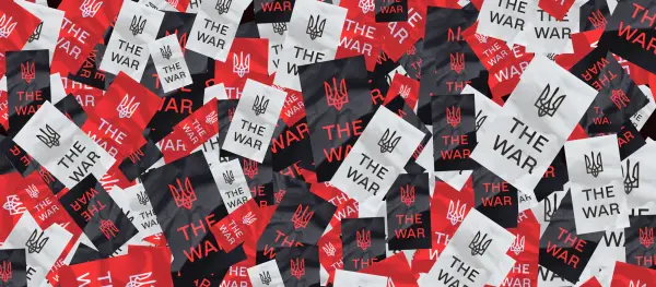
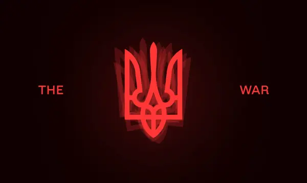
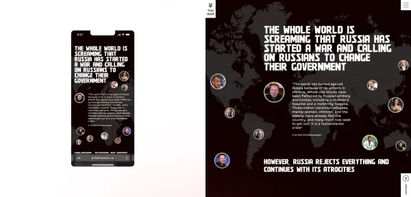
The main colors of the website were red, black, and white, allowing us to create a strict and dramatic UX/UI design for a historical online project. The emotional aspect of the events is emphasized through visuals and animations, while we successfully balanced text and media in a 50/50 ratio.
Professional interface design for the multimedia project was carried out in Figma, while Readymag was chosen to implement complex transitions and animations. This tech stack allowed us to convey the full depth of the story, creating an intuitive and visually powerful environment that keeps users engaged at every stage of the narrative.
Mission
The main mission of the project is to raise funds to support the country, so special attention was given to the support page. Our interactive portal about the war in Ukraine was designed not only to inform but also to provide a concrete way to help. After the масштабный fundraising campaign for Bayraktars by the Prytula Foundation, the choice was clear — we integrated this specific foundation.
A well-designed online platform for historical memory allows visitors to move from empathy to action. We created a direct bridge between learning about tragic events and contributing to victory, turning every reader from a passive observer into an active supporter of Ukraine.
Result
We created a unique resource that presents history from a completely new perspective. The completed interactive timeline website of the war in Ukraine attracted significant attention: within just one week, the project reached 4,400 unique visits and received active support from Ukrainian celebrities.
This web platform for analyzing war events proved highly effective — more than 400 users visited the Prytula Foundation page to make donations. We managed to transform dry statistics into a living story that resonates with audiences and encourages the international community to provide real support.


.svg)


