Website interface design for a startup from London, UK | Finverity
Financial startup Finverity asked us to develop and optimize all the interfaces. It is a marketplace that connects investors ready to allocate funds with borrowers who want to invest in their projects.
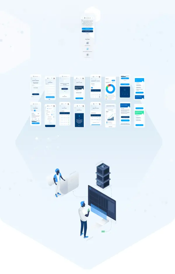
The website’s interface is divided into three parts. The main page has a general marketing presentation. Then, two different parts follow the investor’s and the borrower’s accounts. Each role has its behavior logic, business nuances, interface features, and graphical presentation.

We helped the client at the design development stage by rethinking the task. We could draw what was asked of us. Instead, we were thinking, analyzing, arguing, and looking for ways to improve the website. Some planned work became unnecessary, and we offered something new instead. With us, the client began to understand the project better.
We drew an investor’s account, worked through all the logic, and then a borrower’s account appeared. When both accounts were drawn, we made a series of illustrations and all interfaces for the mobile adaptation.
