Branding and corporate identity for Odesa subway
We are very disappointed that Odesa does not have a metro. It is often promised, but the project is constantly postponed “for later.” We started thinking about how this situation could be changed and decided that the best contribution on our side would be to design a brand for the Odesa Metro. Thus, a semi-joking idea of branding a non-existent subway system evolved into serious work on the visual identity of the city.
A professional visual identity for the Odesa metro system allowed us to imagine how navigation and communication in urban transport could look. We created a full identity system that includes a logo, line maps, and card design, turning the dream of a metro into a tangible concept that inspires citizens and sets a benchmark for the development of transport infrastructure.

Any metro system is recognized by its logo. Since we were working on a logo for the Odesa metro that does not actually exist, we decided not to limit ourselves to the classic “M” and explored the boldest options. This allowed us to create a unique symbol reflecting the spirit of the city and its maritime character.
This visual concept for the metro became the foundation of the entire graphic system. We aimed for the sign to be simple, memorable, and easily scalable. In the end, we managed to develop a modern and minimalistic design that could become a worthy visual code for a real future transport system.

However, we had to consider that worldwide the “M” is the universal symbol of subways, and without it tourists might find orientation difficult. Therefore, the development of the Odesa metro visual identity was based on a balance between tradition and local meaning. In the end, we removed unnecessary decoration and settled on a minimalistic sea-colored logo with the letters OM.
This visual identity for public transport made the brand clear and functional. We preserved a familiar visual form but filled it with new meaning strongly associated with the city. The simplicity of the solution ensures that even within a large-scale infrastructure project, navigation remains clean and recognizable for every passenger.



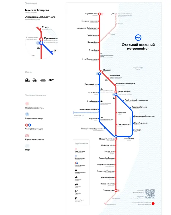
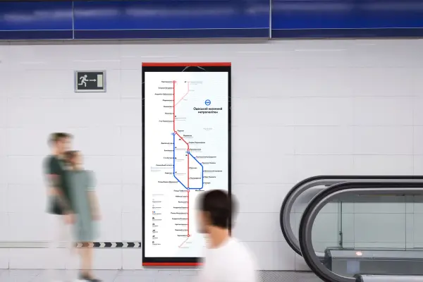
We created the metro map several times, and each version was discarded. One of them included as many as four lines to cover the city as much as possible, but it was chaos. In the end, we printed out a city map and placed stations in the most popular locations, creating a truly functional transport branding system.
This detailed development of the metro visual concept allowed us to move from chaos to a clear structure. We focused on navigation usability so that the future map would be intuitive for every resident. This was an important design stage where creative exploration intersected with the real geography of the city, turning graphics into a useful tool for passengers.
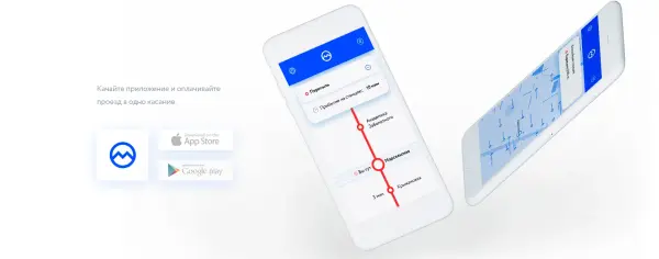
We also designed the look of a mobile app for quick fare payment and paper tickets for those who haven’t installed it. Strong public transport identity is reflected in such details, turning our metro vision into a realistic and well-thought-out service where every passenger interaction feels modern.
Such comprehensive branding for infrastructure projects in Odesa allowed us to go beyond a simple logo. We created a full ecosystem that includes not only navigation but also payment tools. This added depth to the project, showing how visual culture and convenient digital solutions can completely transform the perception of everyday city travel.

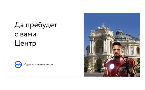
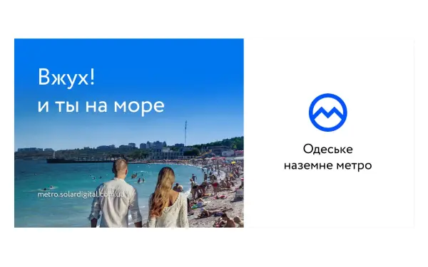
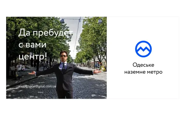
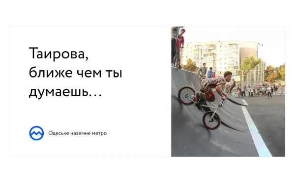
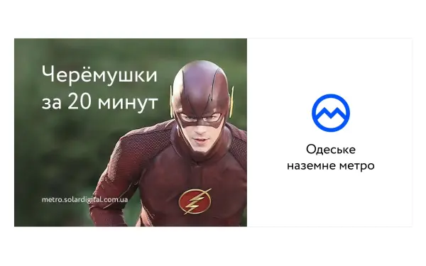
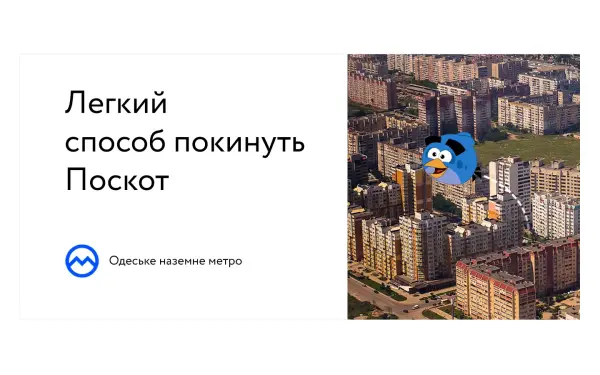
The main fear of future passengers is losing time. We turned this idea into playful slogans, which later evolved into a full branding system for urban transport. By creating personalized messages for residents of different districts, we aimed to resonate with every Odesa citizen and make the project feel alive.
This visual identity for transport projects helped establish an emotional connection with the audience. The slogans do not just inform — they express the city’s character. As a result, we managed to create not just static graphics, but a cohesive identity that turns waiting for transport into a reason to smile and makes the brand recognizable at every “station”.
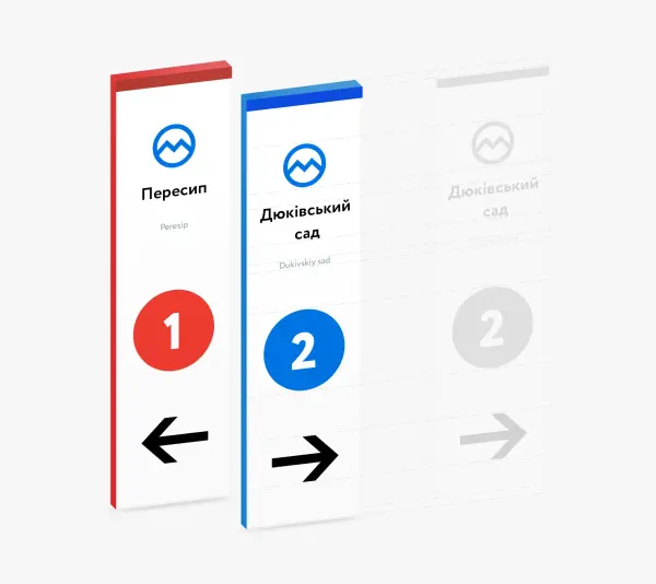
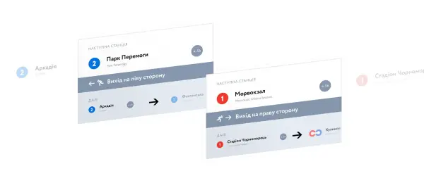
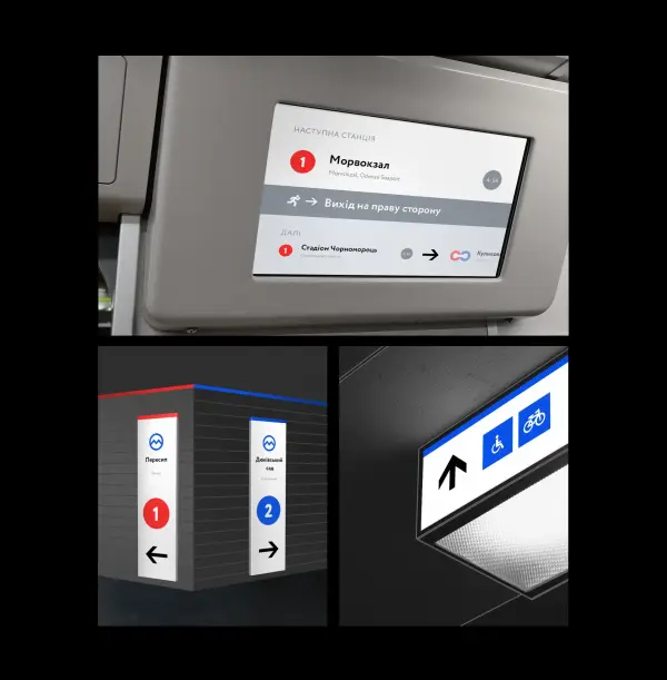
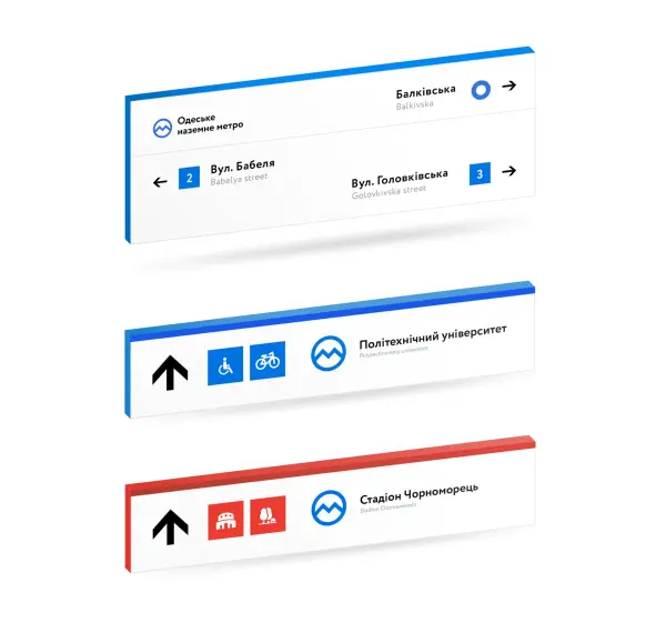
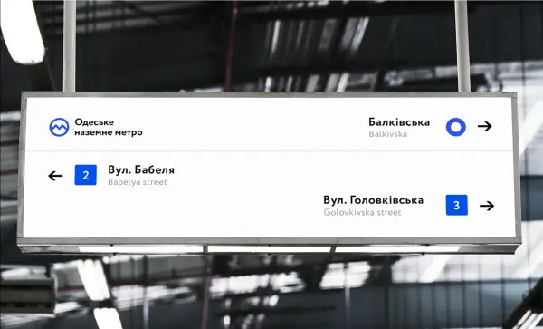
Any infrastructure project must communicate with its audience. It must be a friendly and reliable companion that solves everyday tasks in seconds. Strong branding for urban infrastructure achieves this through clear navigation, helping passengers instantly orient themselves in space.
A well-designed public transport identity turns a dry informational environment into an intuitive system. We aimed for every sign and indicator to build user trust, making the journey as comfortable and predictable as possible. This is the essence of our work — creating a visual language that simplifies urban life.
While working on the map, we realized that the metro could become not just a construction project but the beginning of a new era. Proper transport infrastructure branding can unite key city assets and turn it into an international hub. The idea of branding a non-existent project evolved into a global vision for renewing the entire city of Odesa.
Professional identity design for the Odesa metro helped us visualize a dream and spark people’s imagination. We want to show investors how much potential the city is losing. We sincerely love Odesa and call for collaboration to unlock its potential and turn this bold concept into reality.




.svg)


