Branding and interface of online currency exchange service | Sunduk
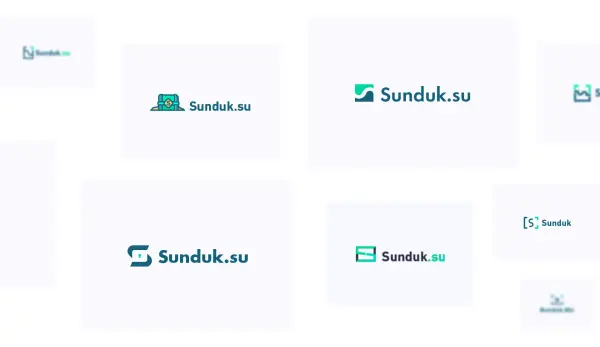
Sunduk, the online currency exchange service, wanted us to create a logo. The name of the service means 'chest' in Russian, so the company logo must at least remind it.
We have made several web interfaces for future websites.

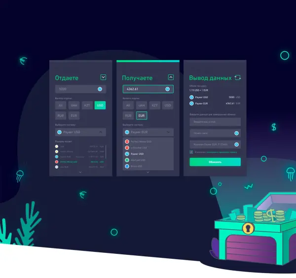
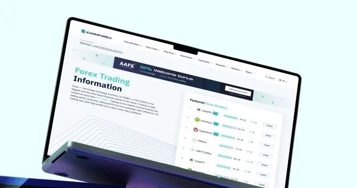
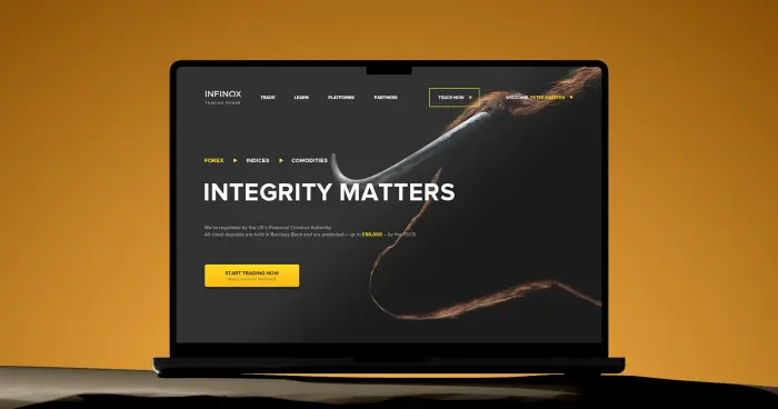
Online currency websites are similar, and we needed an unfamiliar interface to catch the user’s attention. Here are some differences from Sunduk’s competitors.
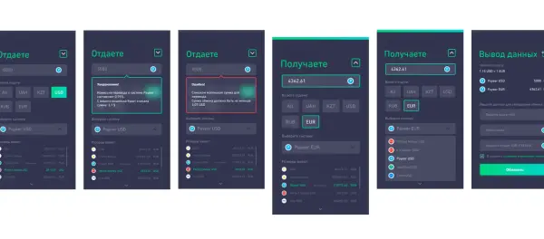
Many online exchange services split screens into several parts: here’s what you give — and here’s what you get — and here’s the result of the operation. In such a way, you see one part of the process and can’t correct the previously entered information. We brought the entire process to one screen so that all the operations could be viewed simultaneously.
Online exchange websites have mainly modest designs. Moreover, they are often loaded with unnecessary information. Our interfaces are more lively, illustrative, and ascetic: they show only what the user requires.


.svg)


