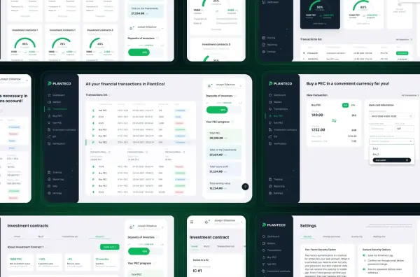
PlantEco: investor’s personal account
PlantEco is an innovative investor platform featuring a mechanism for exchanging fiat and cryptocurrencies into the company’s internal stablecoin. Users can use it to purchase products within the ecosystem. The project is focused on ESG investments online, promoting agro- and bioeconomy startups through a direct blockchain connection between real-world production and digital assets. This fintech platform development bridges traditional industrial sectors with modern financial instruments.
Project Mission
The goal of the project is to stimulate sustainable investments and the development of the EU bioeconomy, addressing global climate challenges while ensuring capital growth for investors. We delivered a modern private investment platform where ease of use, security, and constant asset accessibility were critical priorities.
This investment platform enables fast balance top-ups and seamless purchases, transforming complex financial mechanisms into an intuitive online investment service working for the benefit of the planet.
Problem
The client approached us to design a logo and develop the UI/UX of the investment platform, ensuring a clear and engaging brand introduction.
The main issue with the previous product was a confusing interface. Potential users did not understand how to start investing in the bioeconomy or how the system worked, which reduced trust and conversions. Our task was to redesign the investment service, remove these barriers, and turn a complex financial product into an intuitive tool for everyone.
Task
We were tasked with building a full-scale investment portal designed to introduce the company and clearly demonstrate how sustainable investment platforms operate. The website needed not only to explain bioeconomy concepts but also to help users calculate potential returns through a dedicated calculator.
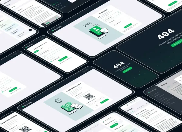
At the same time, we developed a detailed fintech system including an investor personal account. We implemented advanced functionality: from KYC onboarding and investment contract management to token purchases and direct blockchain integration.
Story Map & User Flow:
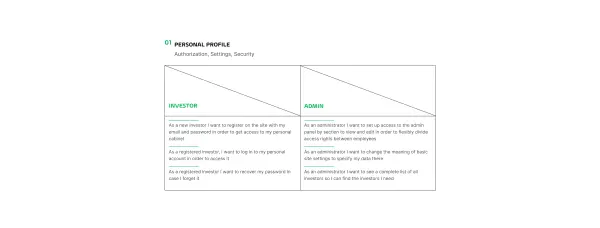
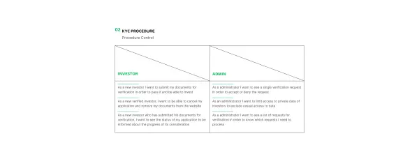
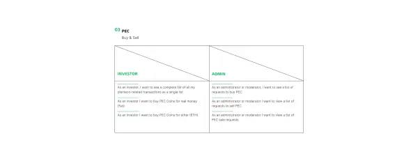
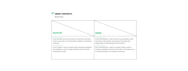
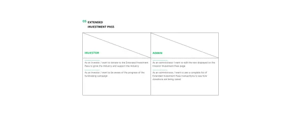
Story mapping became a key tool that helped us define product functionality and prioritize release stages. It allowed us to understand what an effective investment management website should look like from the end-user perspective.
We used user flows to visualize the investor journey. Mapping scenarios helped us define every step — from registration to asset purchase — ensuring the platform remains intuitive and logical for private investors.
User Flow:
• LOGIN → Sign up/Authorization — Email — Password — Repeat password → LOGIN
• KYC PROCESS → Identification — Verification — User verified → USER ACCESSES THE IPC
• IPC ACCESS → Security — Personal data — Training — Current PEC rate — My PEC balance — Contracts
Logo & Styles:
Client’s wish:
- logo emotion — related to status, cleanliness, and eco-friendliness;
- keywords: agribusiness, ecology, climate change, eco-products;
- visual: sign (symbol), original font, the status line under the logo (without visual dominance), minimalism, brevity;
- system of elements: abstraction;
- colors: environmentally friendly.
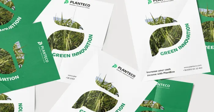
Our solution: a stylized letter P + sprout as a hidden symbol of agribusiness and sustainability.



Prototyping & Design System
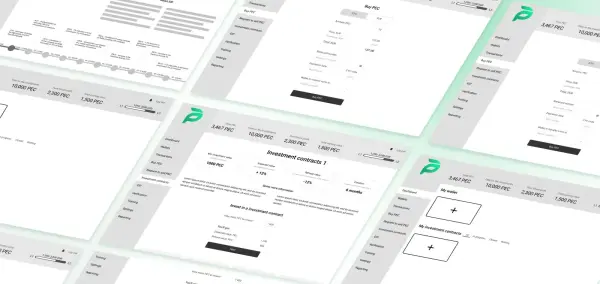
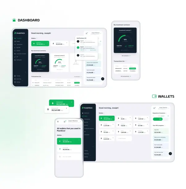
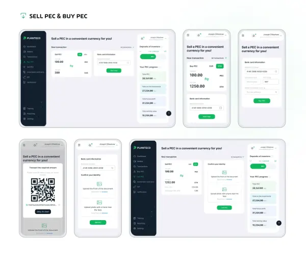
We placed strong emphasis on UI design, as professional investment platform development requires precision in every detail. Creating detailed screen prototypes helped us define product logic at an early stage.
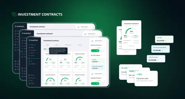
We then built a design system with reusable components and style libraries. This ensured visual consistency across the entire online investment platform and significantly accelerated prototyping and implementation.
.svg)


