NIS: website for a public corporation
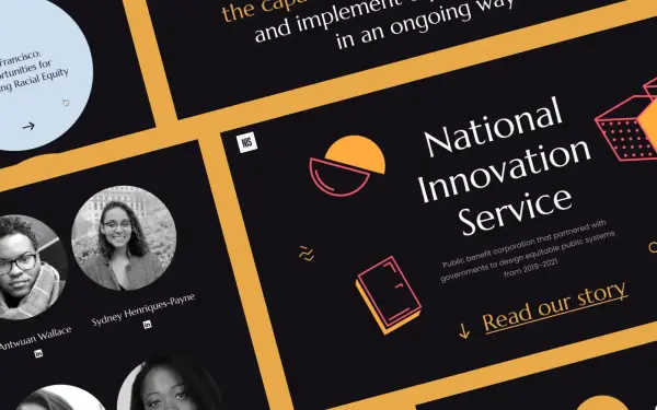
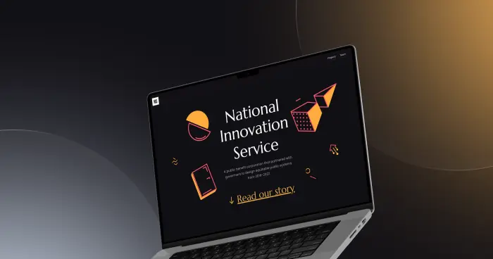
The National Innovation Service is a public benefit corporation partnered with governments to design equitable public systems from 2019–2022
Project Mission
NIS developed an agency dedicated to building government systems that are racially equitable and centered on the needs of marginalized communities. As part of this initiative, a key milestone was the development of a website for a government organization — one that serves as a convenient and accessible tool for citizen engagement. The project involves a deep digitization of public services, ensuring equal access to resources for all segments of the population. We built a flexible web platform for government programs where every element and aspect of the government website design was conceived with inclusivity and user experience in mind — enabling the agency to effectively deliver on its mission at a national level.

Problem
The organization needed assistance with the design and structure of their homepage. We initiated a comprehensive development of the institution’s official website, which included the creation of custom illustrations and graphics. The client’s core request was for a government institution website design that balanced modern aesthetics with intuitive navigation. The goal was to create pages that felt clean and effortless to use. Specifically, the planned government online portal was to feature animated elements on the homepage to enhance user engagement. The client also indicated that preserving the old visual style was not a priority. This gave us the freedom to build a responsive government structure website from scratch — introducing new elements that work in harmony with the content and meet the standards of modern e-government websites.
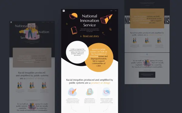
Designing an intuitive user journey through the homepage so that the municipal services website is accessible to every citizen. Creating a clean, minimalist interface of the kind every modern, scalable government website should have. Developing unique branded illustrations and animations that build trust in the government web portal. Delivering web development for government organizations within a tight timeline without compromising on functionality or quality. Comprehensive creation of a government organization website that unites aesthetics and usability in a single product.
User Journey
We conducted research to understand precisely what the target audience expects from projects of this type. Based on the findings, we mapped out a logical user journey through the homepage to ensure the government website would align as closely as possible with citizens' needs. This stage became the foundation on which the further development of the government web portal was built. We designed the interaction logic so that the corporate portal for the government institution would be not only informative but also aligned with the organization’s strategic goals — providing straightforward access to essential resources.
Design and Development
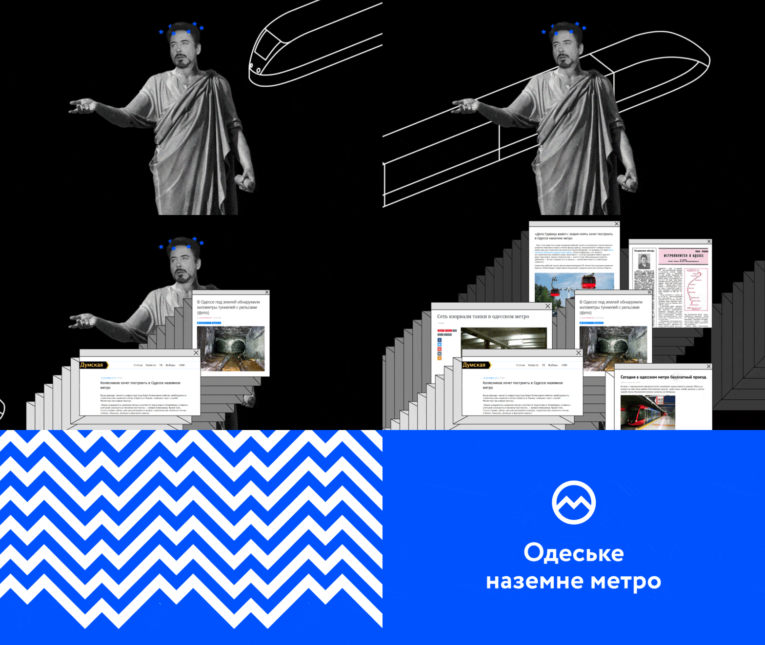
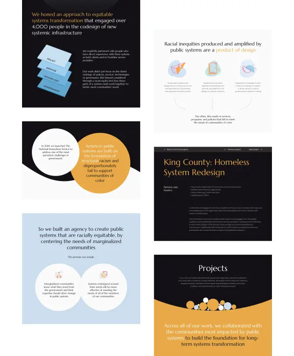
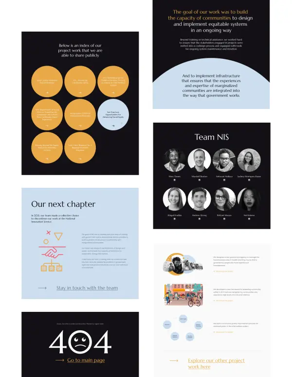
We received a brief calling for maximum simplicity, with the core message delivered primarily through text. Accordingly, the project adopted a restrained yet on-trend color palette — the kind of corporate government website design that keeps the user focused on the content while maintaining an authoritative tone. Working with basic geometric shapes, we created original illustrations featuring gentle animation. This approach allowed the government services website to feel visually engaging while staying well within the bounds of minimalism. Certain text blocks were also placed inside shapes with accent animations, drawing attention to the key messages communicated by the government’s digital services. The final government institution website was built on the Readymag platform. This decision not only significantly accelerated the process but also ensured a high standard of execution — delivering a modern, user‑friendly government website in the shortest possible timeframe.

Result
We delivered the design and development of the government organization’s website in a short timeframe, which the client was very pleased with. The illustrations blended seamlessly with the site’s overall style and brand identity. Key text messages were highlighted and reinforced through animation and graphics. The website was well received by both users and members of the organization. The project resulted in a strong testimonial — and a new long-term client and partner.

.svg)


