Design and Front-end development for the brand clothing store The Sady Pobedy
Boutique gallery exclusively offers its customers new collections of leading elite clothing brands—expensive, modern, stylish. Sales have been built entirely offline for many years. However, the world is changing, competitors are appearing, consumer habits are changing, and the decision to develop an online store has become inevitable. Solar Digital was chosen as a partner in the design and front-end development of the e‑commerce platform among a number of rather strong applicants.
The project started with the Discovery Stage. We studied the structure of product categories, listened to audio recordings of consultants' communication with clients, studied the photo shoot process, analyzed examples of successful international solutions, and created a mood board. Our experience implementing similar projects for the European market was really helpful. It is pleasant to note that the client listened to our recommendations and was open to new ideas. After several iterations, a Design Concept was chosen for further work.
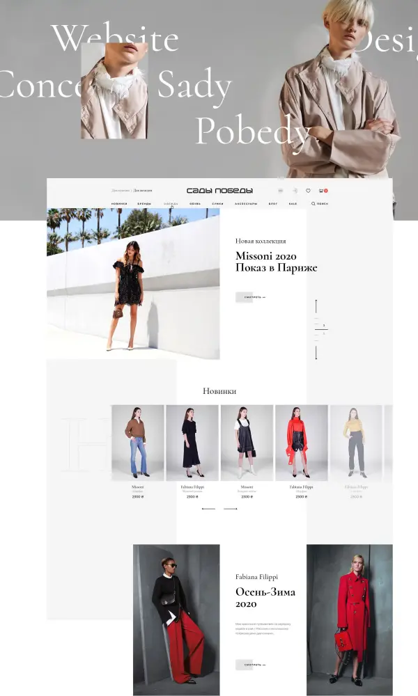
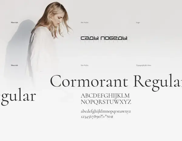
By the way, the design stage started with the logo restoration. The Sady Pobedy logo has not been changed since 2007. Considering that we only had the old logo at the time of the website design, we decided to modify and refresh it slightly. At the same time, we left its style and recognition but made it more accessible, simpler, and more efficient.
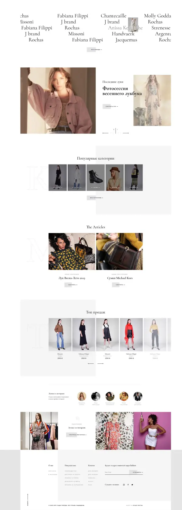
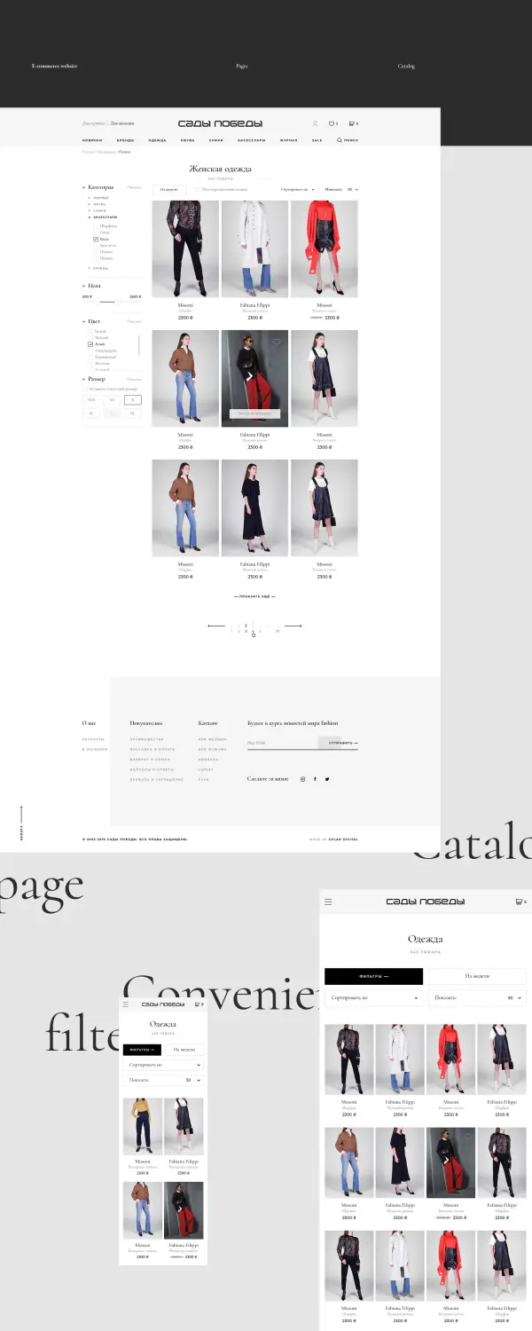
We spent most of our attention on work on catalog logic. We have minimized filtering, universal options for sorting results, and made several options for displaying product photos: the model & product photos. We have also implemented filtering the catalog by price with personal discounts for authorized users.
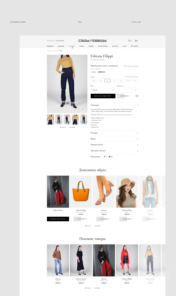
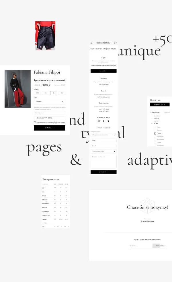
One more challenging point was the product description page. Almost any user action is feasible in a couple of clicks. At the same time, the page design is thoughtful enough to correctly display the dynamic content of the description of various goods. Some goods may have a lot of descriptions, and some may be optional. But the product card look and feel will be equally good. This will make the product card page look equally good.
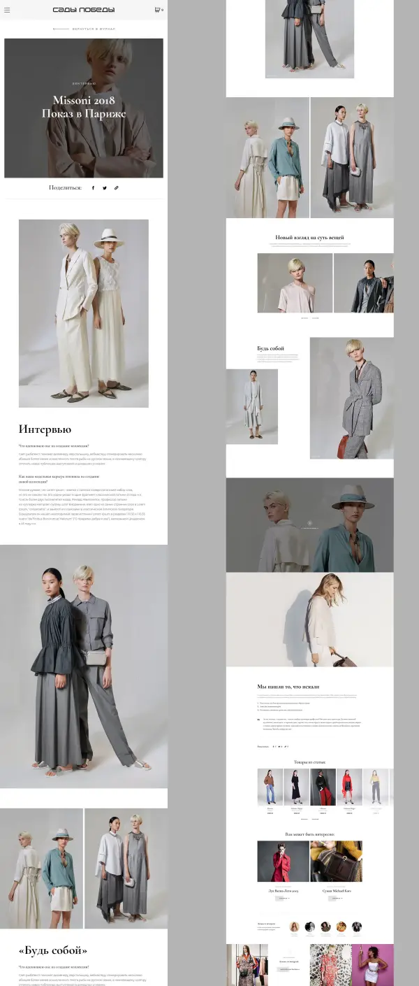
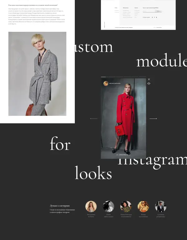
Particular attention was paid to the blocks “Similar products” and “Add image.” Our analytics have shown that a number of international trendsetters are actively connecting blog content with product catalogs, encouraging shoppers to add all the items from the image described in the blog to their shopping cart.
We tried to make checking goods in the basket and placing an order as predictable and familiar as possible.
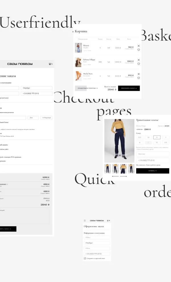
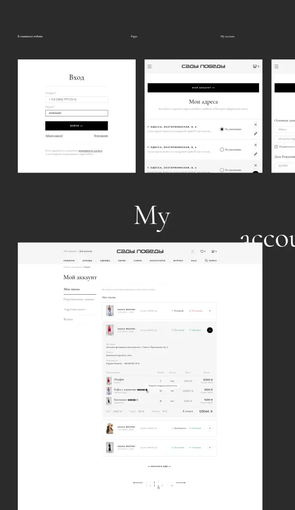
The personal account combines many scenarios for customer behavior, from the usual history of viewing orders to partial positions returns from a receipt.
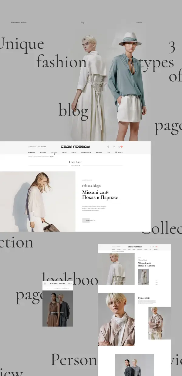
We deliberately made the catalog more familiar and intuitive, but the blog is an entirely different song. We have developed various options for the original text layout, photo reviews, and video presentation of new collections of brands and images. Considering that most of the luxury goods segment’s audience is very Instagramish and spends a lot of time there, the customer’s marketer and I had an idea to make a photo gallery in the story format.
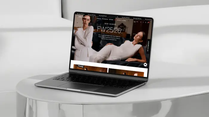
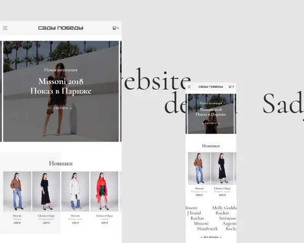
Naturally, special attention was paid to mobile and tablet screen interface development.
The design of The Sady Pobedy combines minimalism and airiness to meet international fashion industry standards and modern trends in commerce interfaces. After the design was approved, we created a layout of all pages and the front-end basis. The client planned to perform server development and the project’s final launch with the assistance of a full-time team. We hope that soon, the clients of The Sady Pobedy boutiques can use the online platform as the set of design ideas and original features we have implemented to increase the client’s income.