Branding for Benova
Benova is a company that provides SAP enterprise support. It is also an SAP Golden Certified Partner, and as of 2019, Benova was the only SAP-certified partner in Ukraine.
So, they wanted to refresh their branding. Not that complete re-branding was their goal, but it was something they would be okay discussing. So, we started working on their brand identity.
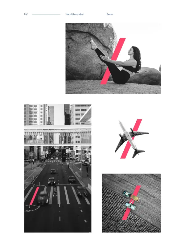
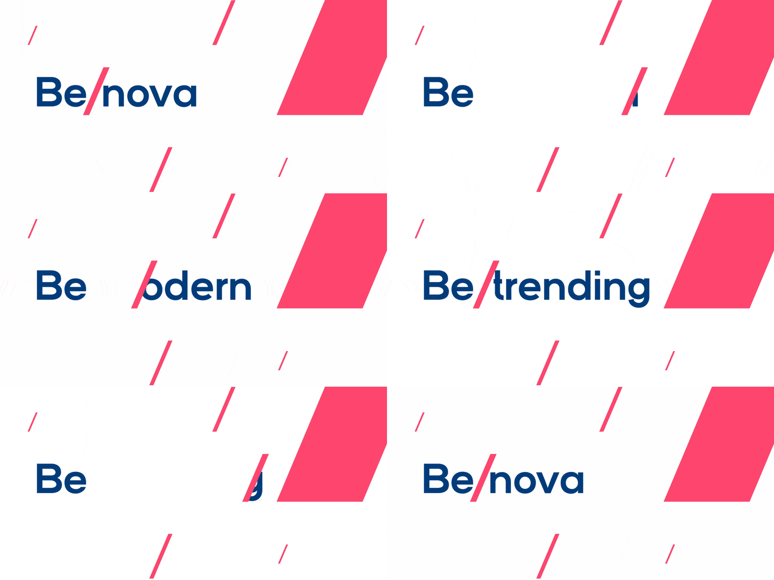
We have developed a scalable sign—a fraction or “slash,” symbolizing the rise. A wash follows the slash—“Be nova,” “Be modern,” or “Be trending.”
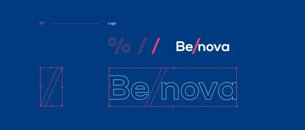
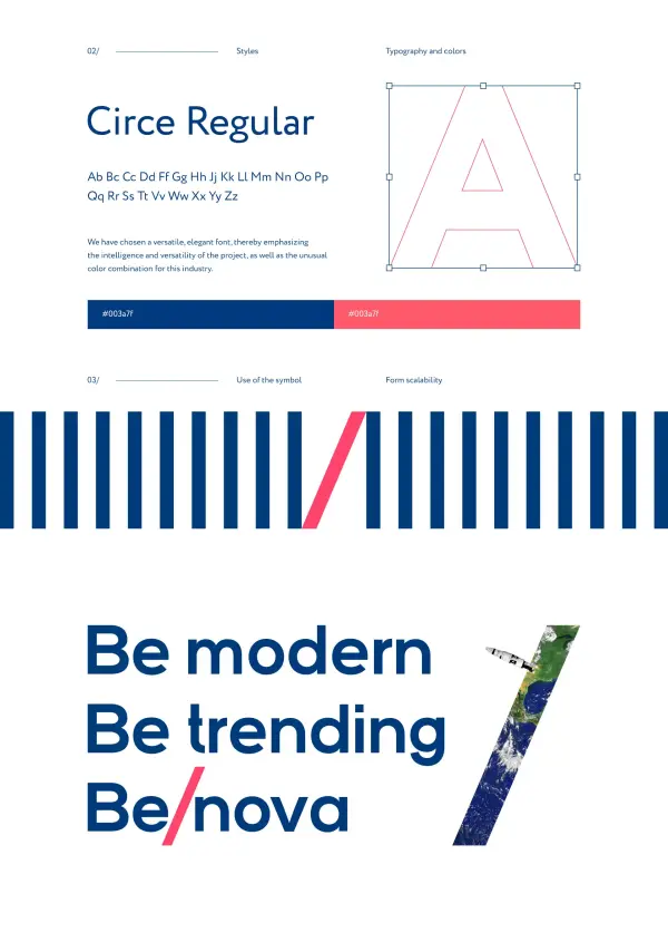
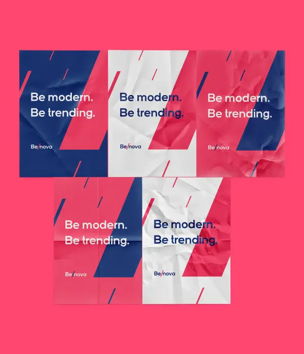
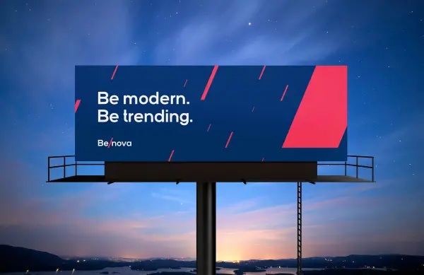
This sign can be combined with any image and activity Benova serves — it is a design code, not just a logo.
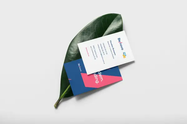
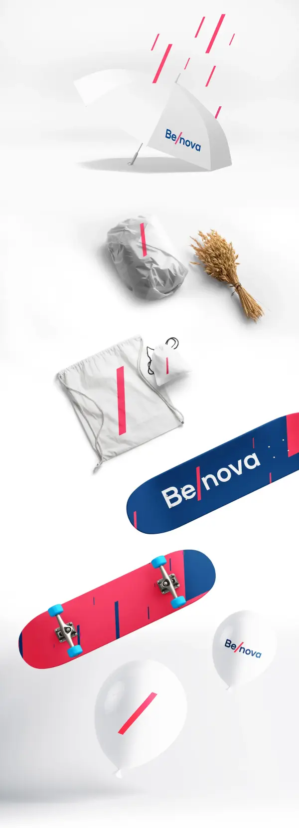
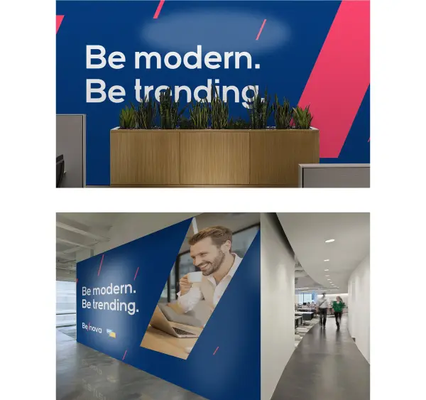
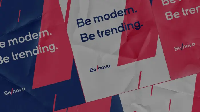
We worked out the corporate style and showed the logo in action.





.svg)


