Corporate identity for 7 ports
Logo and a universal corporate identity for 7 Ports, a company engaged in the supply of ships and sea transportation of raid ships.

The logos of companies in the transportation market are similar: ships, sea waves, and cargo cranes. It’s hard to catch your eye and remember a company with a similar identity. The sign displays an anchor as the main element of the raid ship.
The minimalistic 7 Ports logo combines an anchor and a stylized red-black number 7, associated with the ship’s bow.
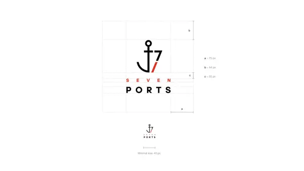
The precise geometry and conciseness of the elements symbolize the professionalism and reliability of the company.
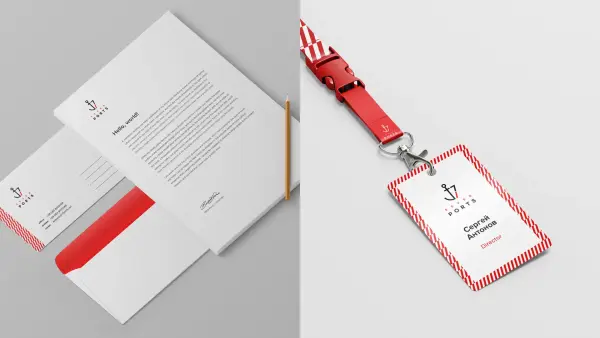
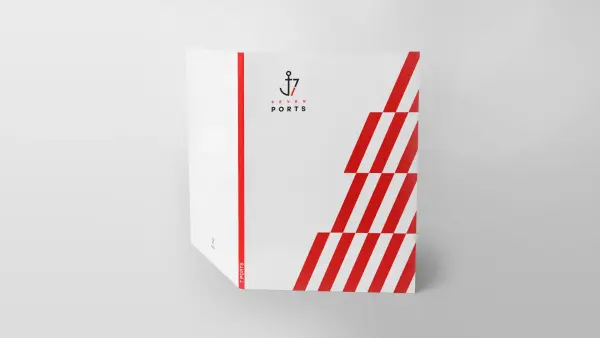
Corporate identity is the repetition of a bright logo element. The pattern is universal and easily adapts to any media.
7 Ports is involved in ship supply and maritime transport of raid ships. The semantic branding platform has impeccable clarity and importance to every detail without unnecessary actions — important qualities in shipping.
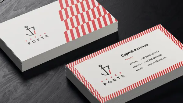
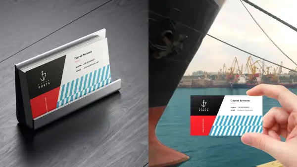
7 Ports сorporate identity is versatile and easily adapts to any media.


.svg)