Domova | Branding, Web Design & Development
Domova helps apartment owners agree on the collective sale of a building, creating transparent conditions for all participants. Professional web development for developers and construction companies allowed us to implement a complex collective application mechanism and automate the property acquisition process.
In addition to the technical part, an important role was played by the unique brand identity for the real estate online platform, which builds trust among users and emphasizes the social significance of the project. Thanks to this, registered users receive not only a convenient tool for transactions but also comprehensive support on issues related to the resettlement of apartment buildings.
Client
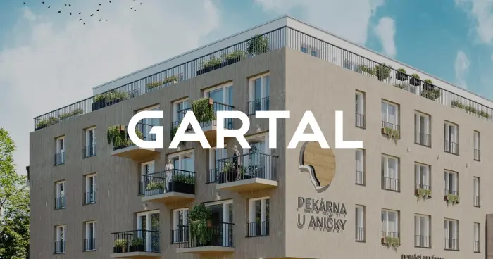
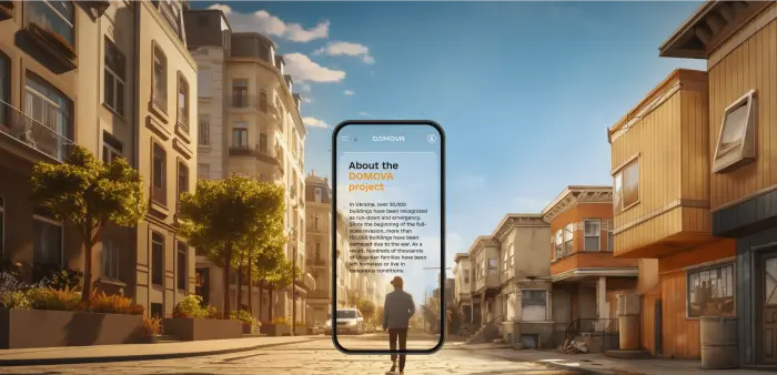
The Domova project is a unique European startup that unites owners of premises in emergency buildings for the collective sale of properties to developers. Implementing this case, we understood that the UX/UI design of a website for this type of real estate market had to be impeccable in order to effectively connect private individuals with large capital.
The client’s goal is to create a powerful investment tool for the revival of urban districts. As part of the project, comprehensive development of the website and brand identity was carried out, emphasizing the social significance of the mission and helping to breathe new life into architectural landmarks, bringing benefits to all participants in the real estate market.
Challenge
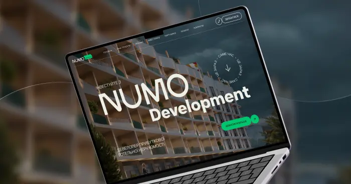
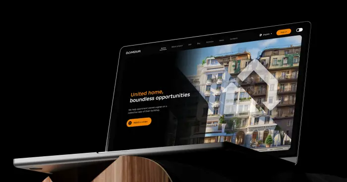
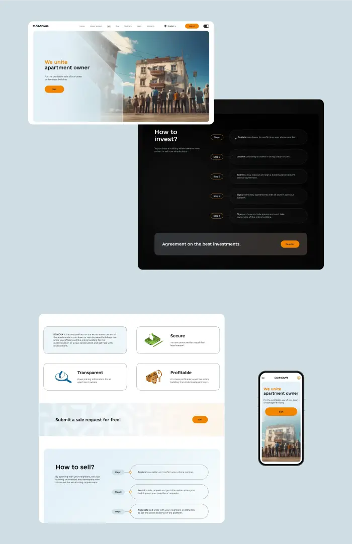
Solar Digital faced the task of creating branding and a promo website for a unique product that combines simplicity with functionality. We needed to implement a quality UX/UI design for a real estate website that would inspire trust and support switching between dark and light themes.
The comprehensive development of branding for real estate included the creation of unique graphic elements that set the project apart in the market. At the same time, we took care of the technical side: the website received a convenient content management system that allows managers to easily update news and information while preserving the aesthetics and integrity of the visual style.
Solution
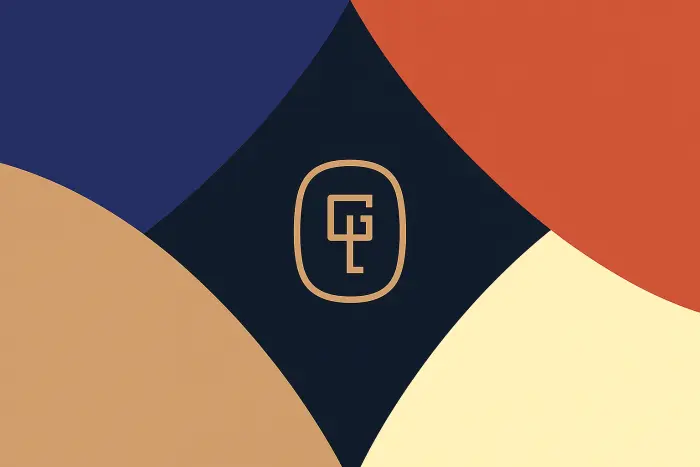
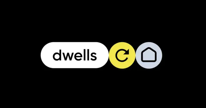
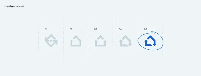
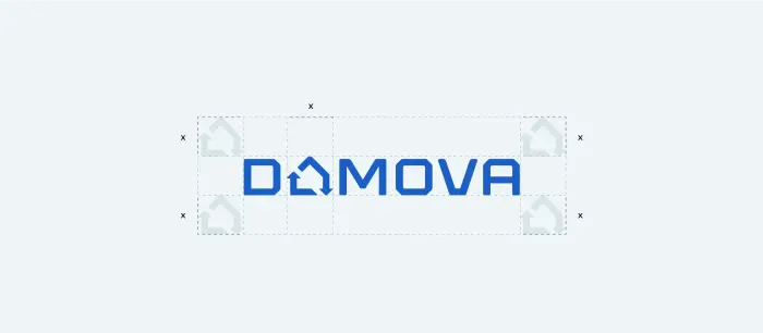
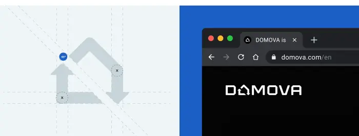
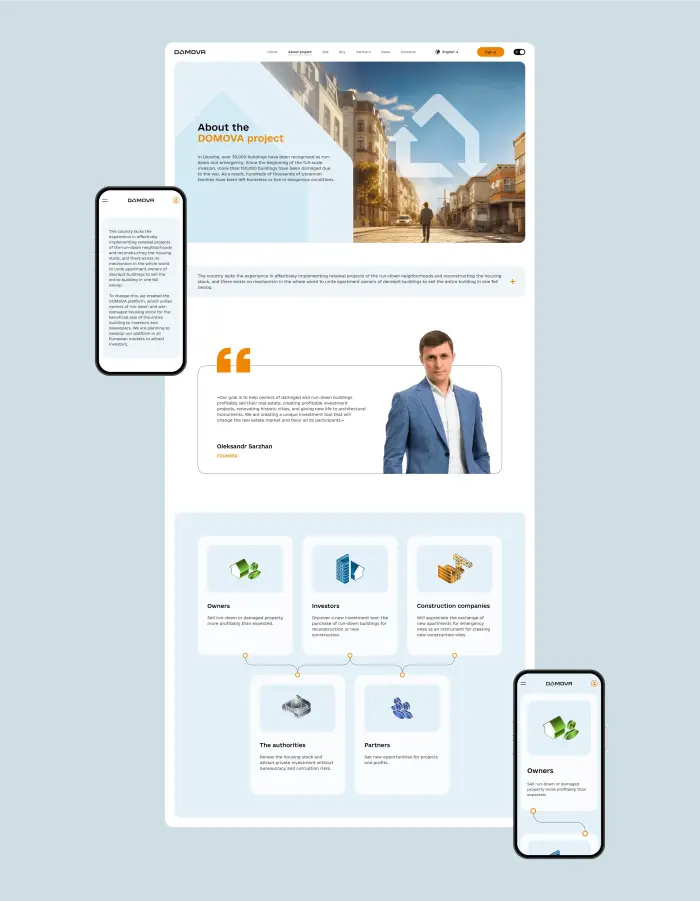
We developed an identity that reflects the essence of this unique project and its mission. The logo is based on the idea of regeneration — the renewal of a dilapidated or emergency building. The brand identity and logo we created for this new type of real estate agency uses blue and light tones as a symbol of trust, while the bright orange accent symbolizes movement and development.
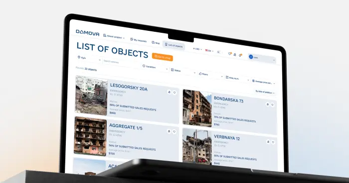
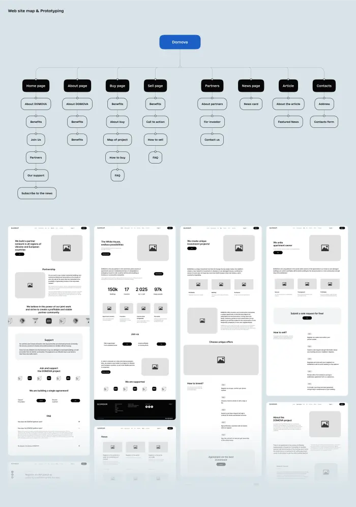
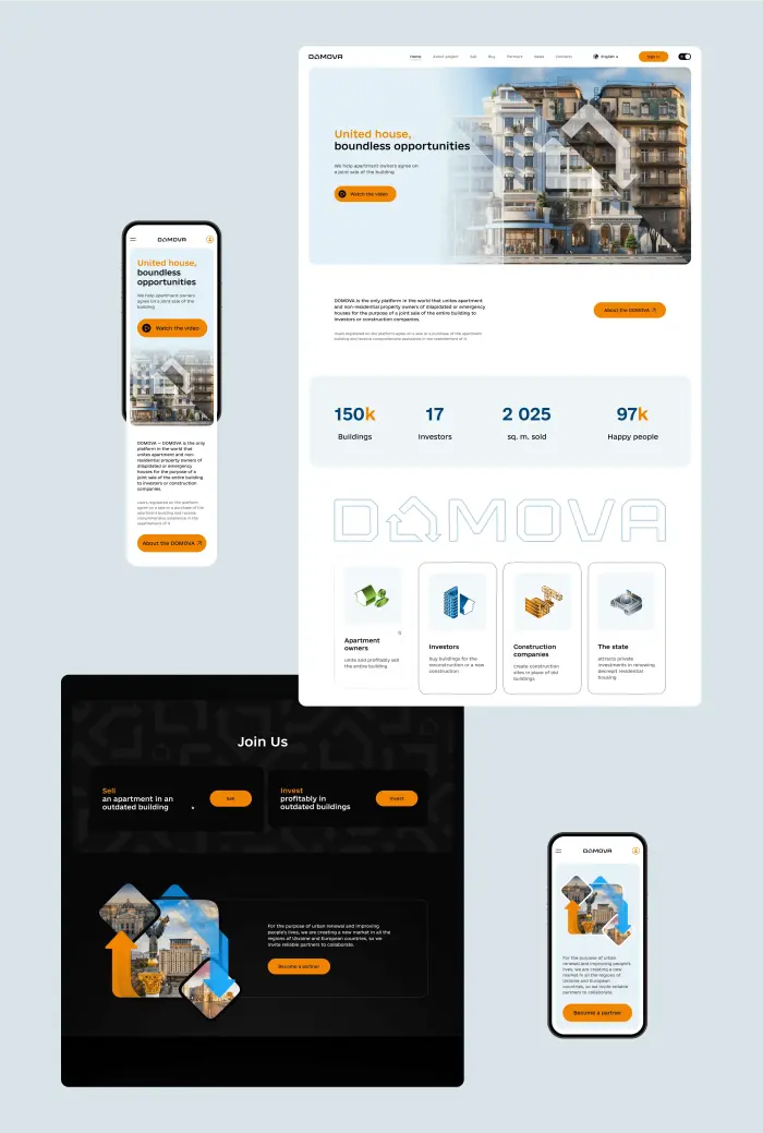
The team then moved on to technical implementation. We developed a modern website design for developers and investors, focusing on a clean layout and ease of navigation. Using WordPress as a CMS allowed content managers to easily manage information, while minimalist elements and subtle animation added the necessary interactivity to the platform, emphasizing a professional approach to solving social challenges.
Result
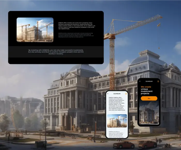
The results of our efforts were an attractive branding and promo website that effectively conveys the value of the platform. The well-thought-out visual brand identity in the real estate sector, including a unique logo and typography, helped us successfully communicate Domova’s mission of facilitating collective property sales.
Moreover, by highlighting the benefits for all parties — from owners to the state — the creation of a corporate website for the development company and investors made it possible to position the project as a catalyst for the renewal of the housing stock. The website design emphasizes the platform’s role in urban environment regeneration, making the interaction process transparent and clear for professional market players.

.svg)