Corporate identity design and logo for a residential complex Dwells
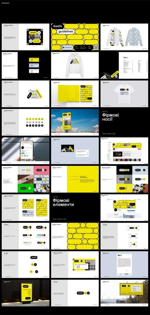
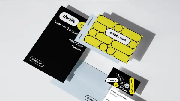
A strong brand should communicate a company’s values, resonate with its target audience, and have a stylish visual identity. Our client, the Dwells residential complex, approached us when they needed a comprehensive brand development that would not only stand out among competitors but also clearly convey the essence of the project. Our team focused on creating a distinctive identity, including a recognizable logo and a brand book with signature colors and typography that highlight Dwells’ identity and attract future residents.
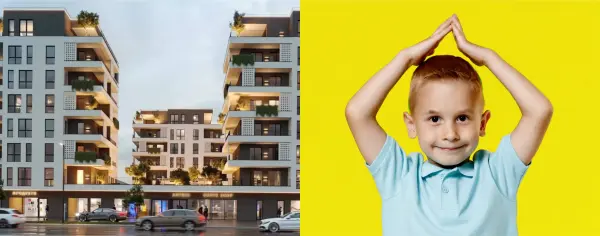
Client
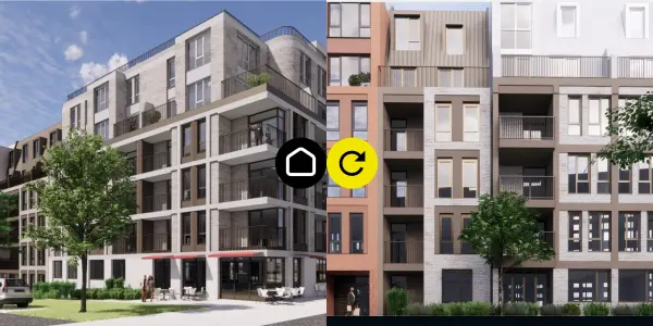
The Dwells residential complex is an ideal choice for young families who value affordable and high-quality housing. The client aims to provide comfort and coziness, with a focus on innovative solutions that meet modern living standards.
One of the key stages of the project was professional real estate branding. We understand that it goes beyond just a logo and color palette — it is about creating a unique style and identity that reflect the company’s values and philosophy.
Task
The task was to create a visual concept for Dwells targeted at young people and family-oriented couples. We aimed to ensure that the brand design reflects the core values of the company — affordable, high-quality housing for young families.
We used imagery of joy and comfort in our materials, focusing on conveying the emotional benefits of living in the new complex.
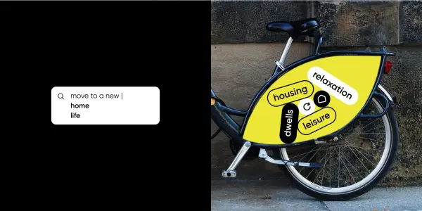
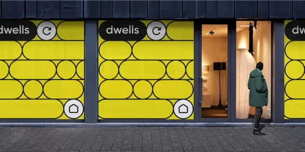
Process
Our team conducted extensive research of both local and international markets. Based on these insights, we developed our own workflow and analyzed best practices in the segment.
By applying advanced design methodologies and a creative approach, we created a residential branding identity that clearly expresses the value and uniqueness of Dwells. Every element of the brand was carefully crafted to meet the needs of the target audience.
That’s why we can confidently say that the branding of Dwells was not based on assumptions, but on research. This allowed us to create a distinctive visual identity that perfectly meets the expectations of young families who value comfort, affordability, and modernity.
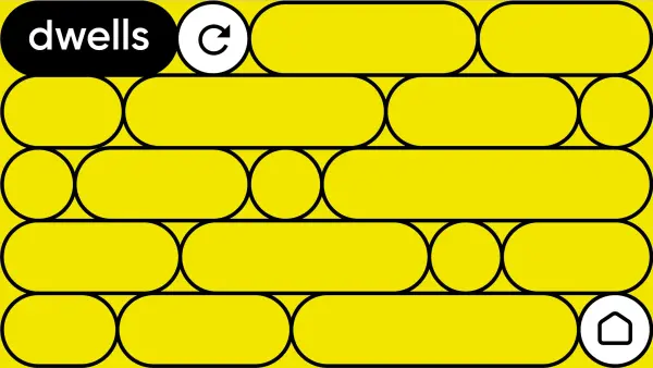
Result
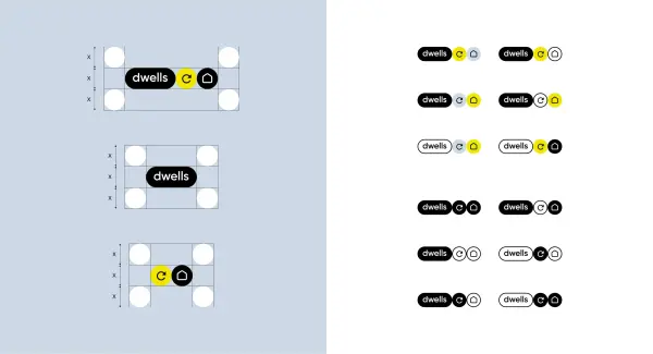
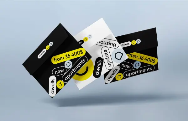
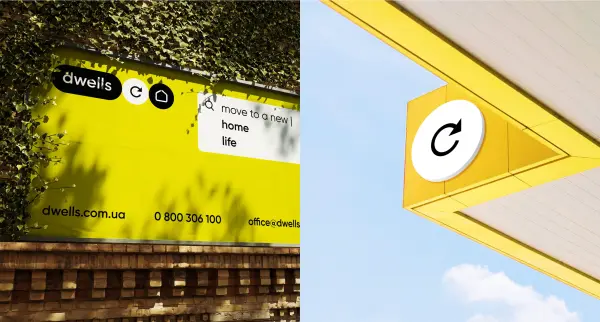
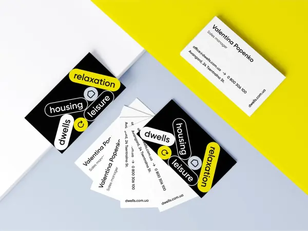
As a result, Solar Digital delivered a comprehensive brand identity for the Dwells residential complex — creative, visually appealing, and easy for the target audience to understand. We chose vibrant colors that combine freshness and innovation to build a lively and memorable brand for the development.
We also focused on modern graphic elements and typography that add visual depth to the design.
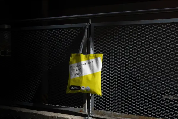
Additionally, we designed stylish merchandise for future residents, perfectly aligned with a modern lifestyle and reinforcing the identity of the new residential complex.

.svg)


