Mayak — Redesign of the online magazine
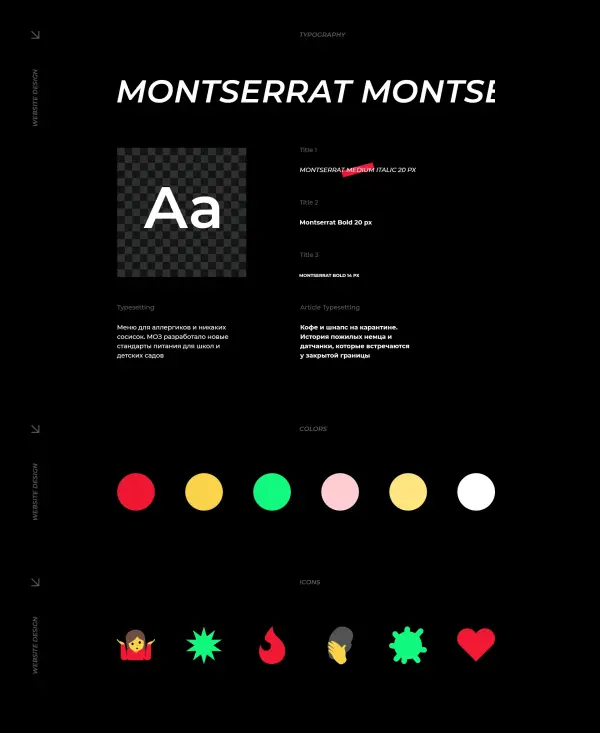
“Mayak” is an all-Ukrainian media outlet about culture and society that decided to undergo a complete reboot for its 6th anniversary. After updating the brand identity, the next logical step was the development of a website for a national media platform, where all the ideas of the new visual concept were brought to life. We aimed to create a resource that would communicate the values of urbanism and human rights through a modern visual language.
A well-thought-out UX/UI design for the online magazine made “Mayak” brighter, more emotional, and more dynamic. Now the platform not only delivers content but also creates a meaningful environment for reader interaction with topics of culture and science. The updated interface emphasizes the independent nature of the publication, making navigation through socially important materials intuitive and engaging.
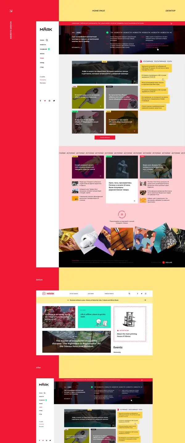
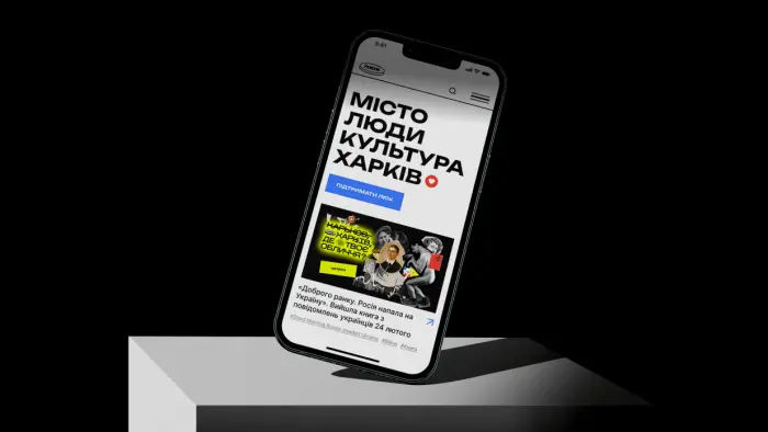
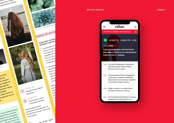
The high traffic rate from mobile device users in 2020 should not surprise anyone. The Mayak is no exception, so we have focused on developing smartphone and tablet screen interfaces.

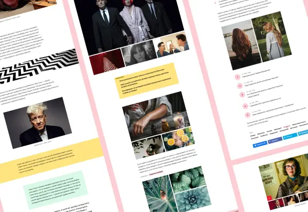
One of the key ways the magazine monetizes is through special projects. They feature complex layouts, so the development of the interface for the online magazine included creating a flexible design system. We designed author blocks, galleries, tables, and unique brutalist design elements such as a ticker line, ensuring that each partner material looks thoughtful and exclusive.
A comprehensive UX/UI design for the online publication in Ukraine made it possible to implement interactive components: from timelines to recommendation blocks and product inserts. Careful attention to every interface detail ensures that special projects are not only informative but also aesthetically appealing, providing users with a seamless content interaction experience on any page of the media portal.


A project “chip” automatically displays up-to-date photos from the Mayak Instagram profile in the footer. Photos animate on hover and update as new posts are released.
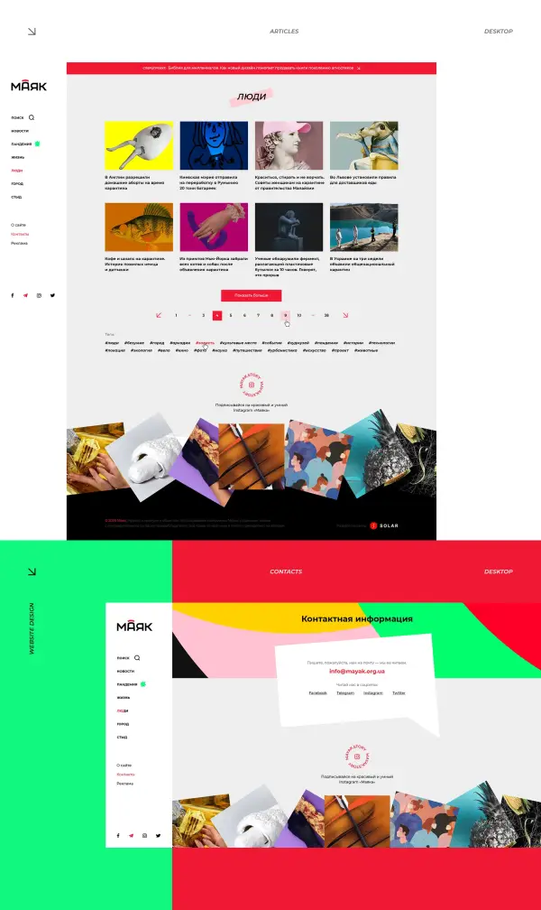
We paid special attention to the auxiliary pages of the project: styled the pricing table and updated the team section, keeping only the recognizable illustrations of team members. High-quality web development for a media portal implies attention to detail even on the 404 error page, which helps maintain visual consistency across all sections.
Such a meticulous approach is essential when creating a website for an independent online magazine, where every page must contribute to audience retention. We rethought the structure of service sections, making them not just functional but an organic part of the updated “Mayak” identity, emphasizing the professionalism and unique style of the editorial team.

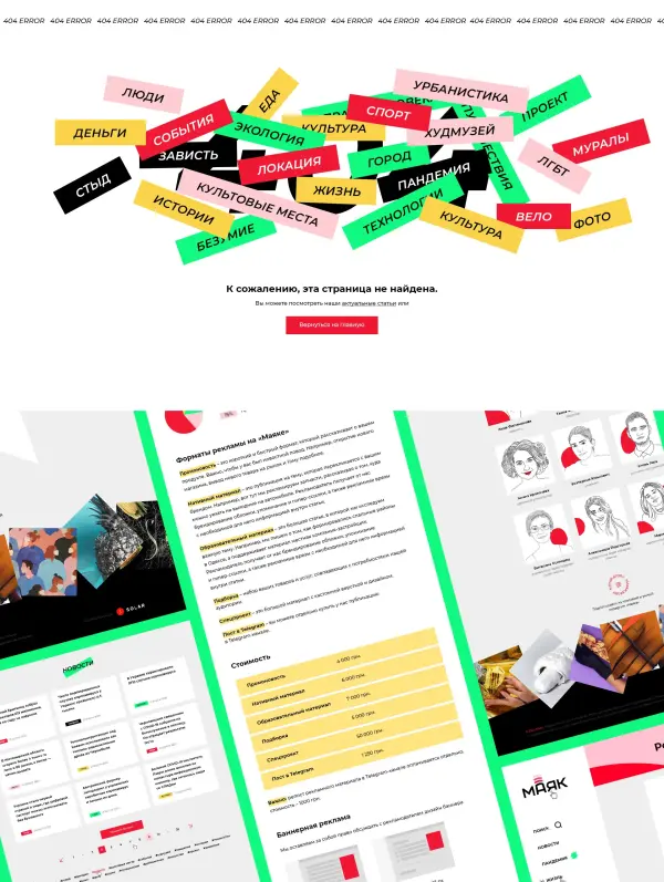
After carefully planning the overall logic and navigation, prototypes, and UX solutions, we created a modern interface design for a news portal. Using the updated brand identity and existing content as a foundation, our team refined every detail and then adapted all pages for smartphone resolutions to ensure convenient reading on any device.
Comprehensive development of the website for an independent media portal allowed us to combine aesthetics and functionality. We paid special attention to the mobile version so that the “Mayak” audience could consume high-quality content in the most comfortable format. The final result became a clear example of what a modern and технологический resource about culture and society should look like.
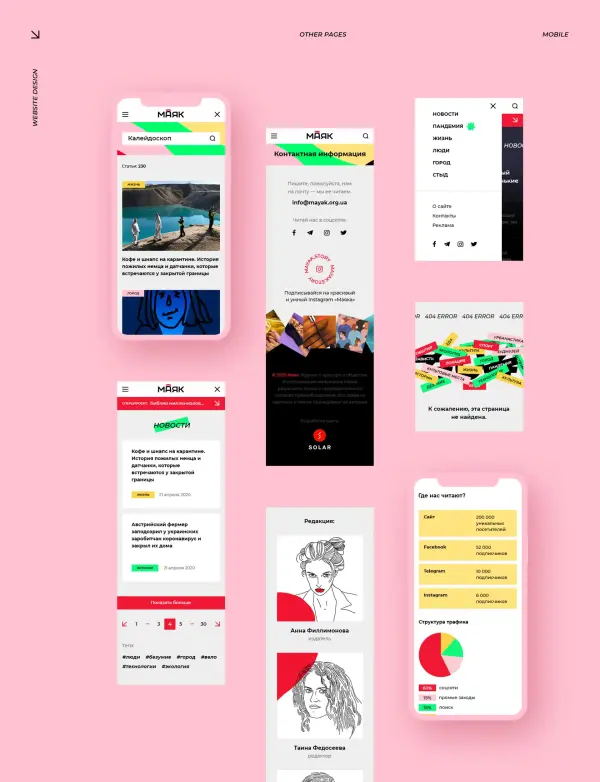
Instead of an afterword: we worked on this project with great enthusiasm. Thanks to the client’s trust, our motivation to deliver outstanding results was at its peak. Professional website development for an independent magazine presented us with a challenging task — working with an old database. We managed to preserve all link equity and update the styles so that the editorial team didn’t have to redo thousands of old articles to match the new design.
Such comprehensive creation of an all-Ukrainian online magazine on WordPress required a number of нестандартных решений. Thanks to the experience of the Solar Digital team, we freed “Mayak” from routine tasks and saved them a month of work. The result is a modern platform that is technically flawless and fully ready for scaling and new ambitious special projects.

.svg)


