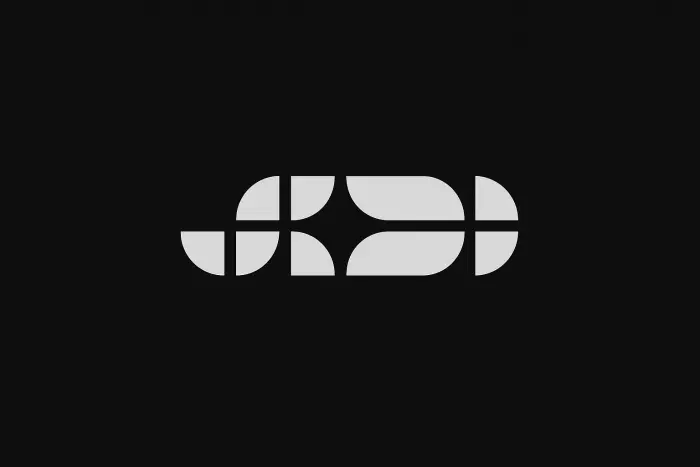
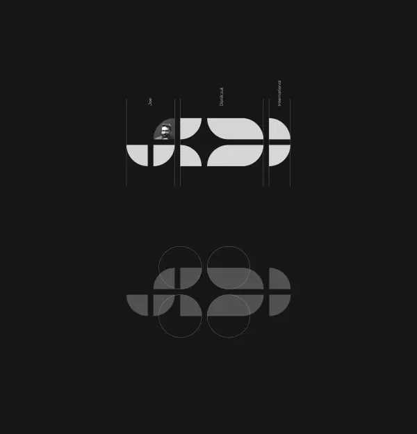
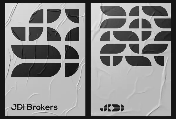
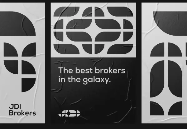
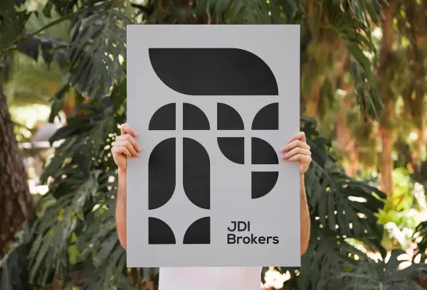
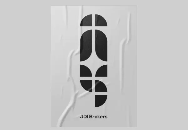
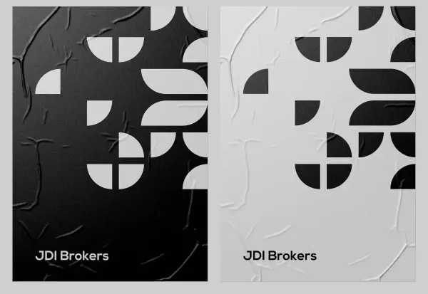
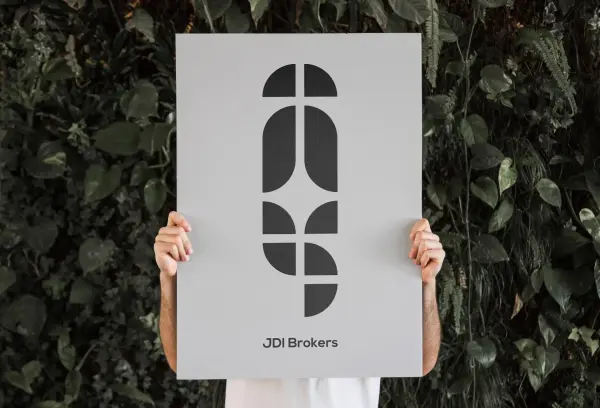
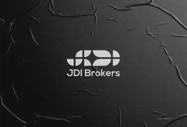
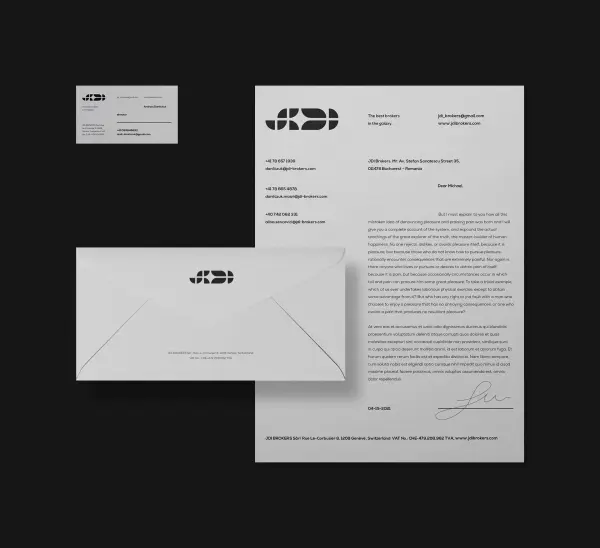
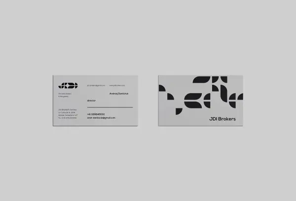
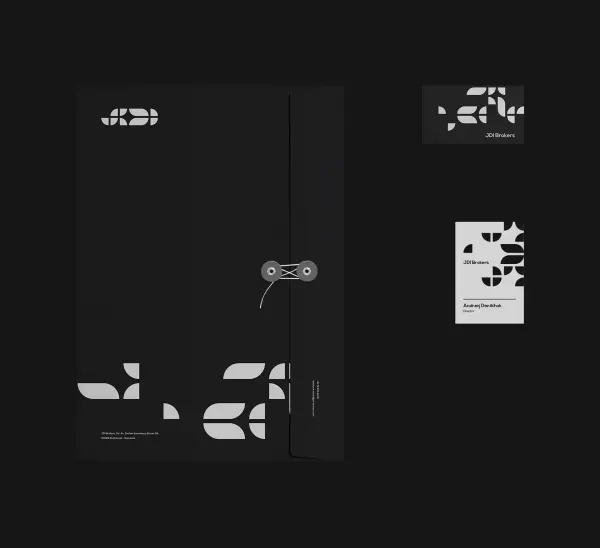
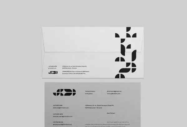
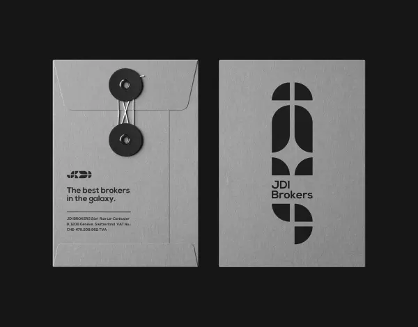
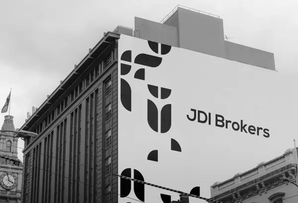
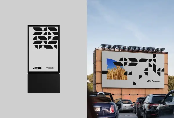
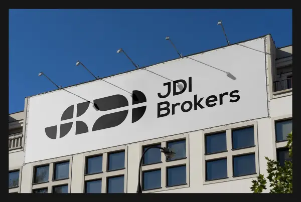
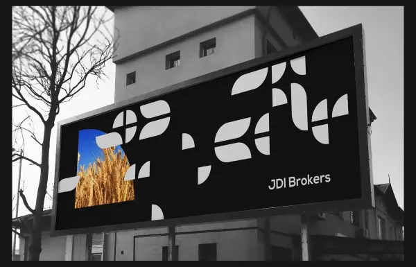
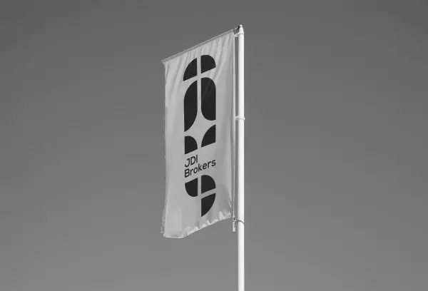
JDI

Branding Development for JDI Brokers. Branding and identity for JDI Brokers

JDI Brokers

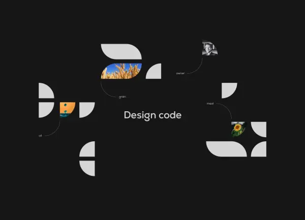
JDI is an abbreviation of the company owner’s father’s name, which, when read quickly, sounds similar to the word “Jedi.”

16207465200.gif

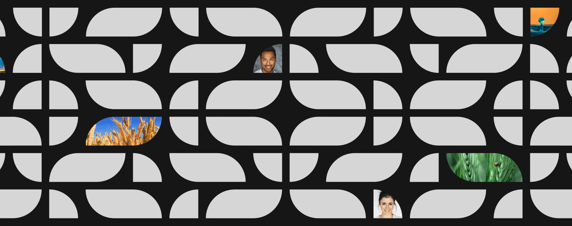
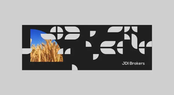
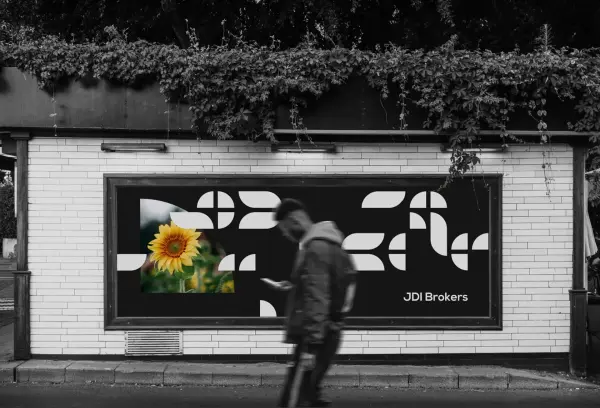
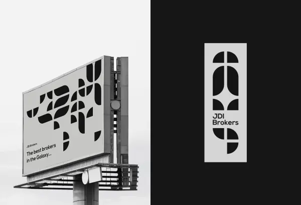
The visual identity is built around a financial company logo designed as a star-sword cutting through the abbreviation formed from plant-based elements — oil, grain, and meal. This approach to branding allowed us to combine the raw materials sector with market dynamics: in animation, the plant motifs symbolize the movement of the product’s core value — information.

16207479710.jpg16207479711.jpg16207479712.jpg16207479713.jpg16207479714.jpg16207479715.jpg16207479716.jpg
16207480760.jpg16207480761.jpg16207480762.jpg16207480763.jpg16207480764.jpg16207480765.jpg16207480766.jpg16207480767.jpg16207480768.jpg16207480769.jpg162074807610.jpg16207481610.gif16207482050.jpg16207482051.jpg16207482052.jpg16207482053.jpg16207482054.jpg16207482055.jpg16207482056.jpg16207482057.jpg16207482058.jpg16207482059.jpg162074820510.jpg
Interesting statistics
8

concepts

2

designers

194

hours

7

zoom calls

Technologies and frameworks
Contact us for a free IT consultation