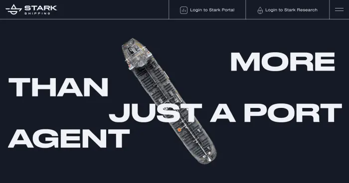
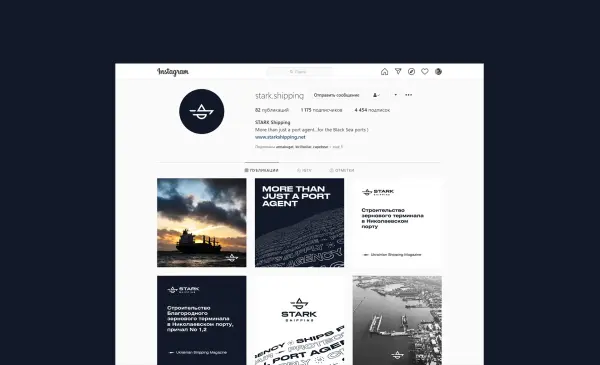
Stark Shipping
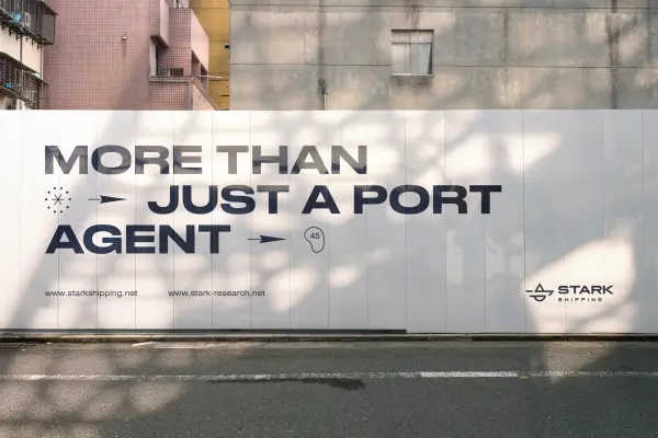
Stark Shipping provides agency services for vessels, professionally controlling the processes of vessel calls and loading of tankers and bulk carriers. Being recognized innovators in their niche, they strive for excellence in everything. That is why a quality identity for a shipping company of this level must convey the reliability and technological nature of the brand. For Stark Shipping we developed and maintain a unique maritime transportation analytics service Stark Research. To visually distinguish the client’s innovative products, a modern brand identity for maritime logistics was created, which emphasized the company’s market leadership and helped effectively present the analytical tools to international partners.
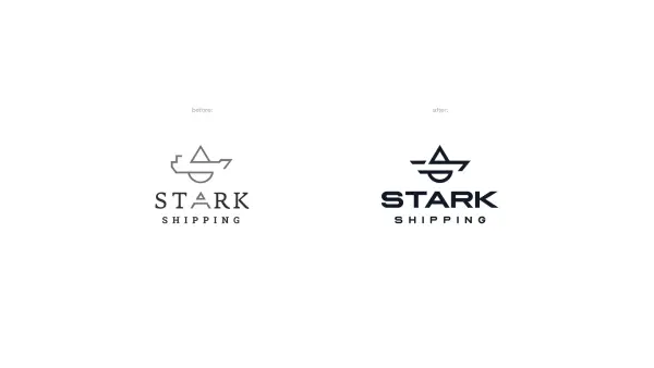
The client came to us with the task of modernizing the brand’s visual image, as we had created the first version of the logo 5 years ago. Since design and the market are constantly evolving, a large-scale rebranding for the maritime transportation agency became a logical step. Several designers worked on the project, creating many variations that differed radically from the previous version.
During the work, an in‑depth development of visual identity for shipping was carried out, which allowed the logo to look relevant and dynamic. We sought to preserve the spirit of the company’s leadership, while creating a concise and modern symbol that meets global trends in the field of maritime logistics and agency services.


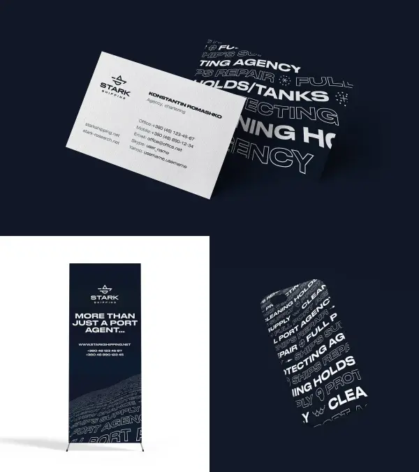
An important condition was preserving the image of a ship, as it is precisely with this that Stark Shipping is associated. Carrying out the logo redesign for the vessel agency, we refined the geometry of the old mark and selected a modern digital font that is perfectly suited for both digital and physical media.
In the updated symbol, we managed to encode not only a drop of liquid cargo but also the silhouette of a tanker. Such detailed development of a visual concept for the maritime business made it possible to preserve the recognizable brand structure, giving it a relevant and technological look that matches the status of an innovative company.
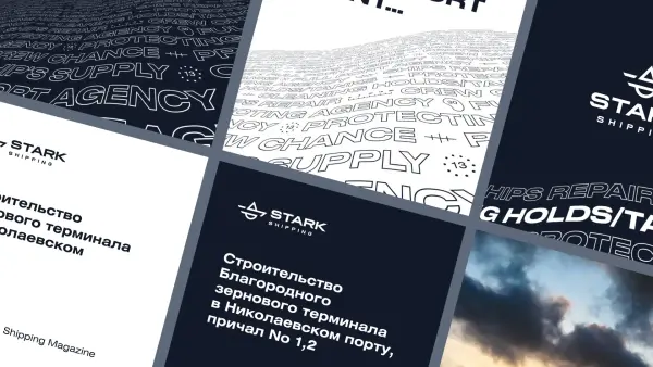

On the wave-shaped pattern we depicted the list of Stark Shipping’s services and thematic icons. Although the version with icons did not make it into the final package, this modern brand identity for shipping companies allows graphic elements to be used selectively in any communications. We kept them in the portfolio as a good example of how detailed identity development for a logistics company can visualize complex maritime processes through simple and clear imagery.
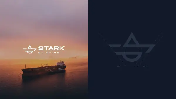
As a result, we’ve created a fresh, bold, modern corporate identity system for Stark Shipping, one of the largest shipping agents in the Black Sea region.


.svg)