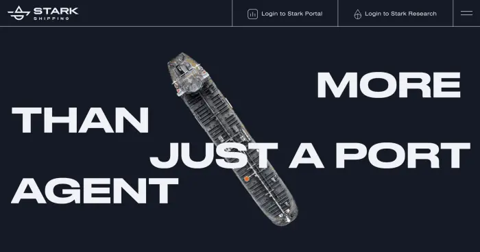
Global Parcel Delivery Platform
Ship.Shop is a digital logistics platform developed by MeestExpress Group, focused on international parcel delivery. Designed for both B2C and B2B users, the product continues to scale across global markets — demanding a consistent, trustworthy digital identity that performs across every touchpoint.
In today’s hyper-competitive digital economy, visual branding is no longer just a visual asset — it’s a strategic driver of brand recognition, trust, and conversion.

Problem
Outdated visuals and limited digital adaptability
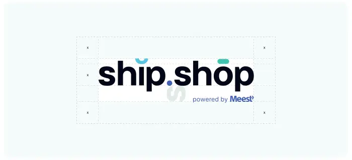
The client’s existing identity was dated and ill-suited for digital use. The logo and brand assets struggled to perform on mobile, packaging, and social platforms — highlighting the urgent need for a responsive logo design and adaptable visual system.
Accessibility non-compliance
The color and type system failed to meet international WCAG standards, limiting usability and inclusivity — a critical issue for brands entering regulated regions like the EU and North America, particularly in sectors like eCommerce logistics and parcel distribution.
Lack of consistency and structure
There was no brand guideline, no templates, and no scalable visual system. Marketing assets were assembled ad hoc, creating brand fragmentation and time loss. For a company with growing marketplace delivery operations, this presented a significant bottleneck.
Solution
We began with a comprehensive audit of the client’s visual identity — evaluating everything from the existing logo and typography to digital touchpoints, packaging, and printed assets. This enabled us to identify usability flaws and inconsistencies across platforms.
What we built:
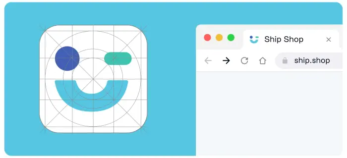
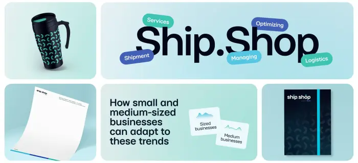
- A flexible, scalable logo design paired with a cohesive brand system, optimized for use across mobile apps, web, print, and merchandise.
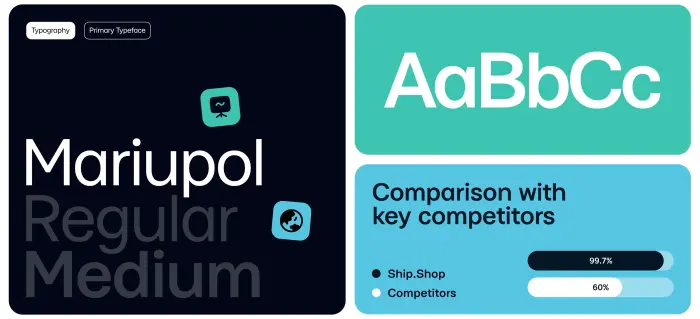
- A WCAG AAA-compliant color palette tested for legibility, accessibility, and high-contrast clarity.
- A clean, versatile type system and iconography set, developed using principles of modern logotype design and UI clarity.
- Modular visual elements that scale effectively across digital-first and physical applications — grounded in digital-first design principles.
Deliverables included:
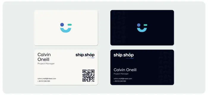
- Several logo and symbol concepts — the client chose the most versatile and clean solution.
- A complete brand identity design toolkit — from typography to spacing rules.
- Digital-ready patterns and visual elements optimized for all resolutions.
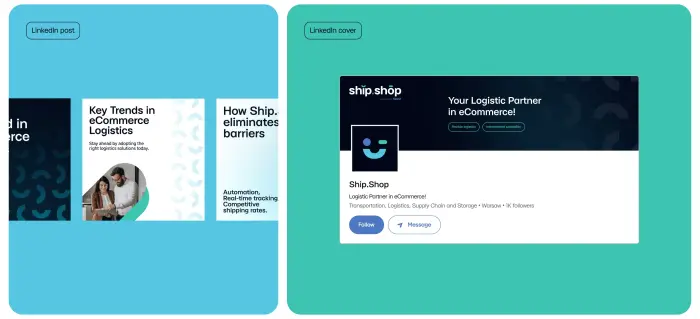
- Social media templates with consistent tone and aesthetics.
- A complete brand guide with usage rules, downloadable assets, and formats (SVG, Figma, PDF).
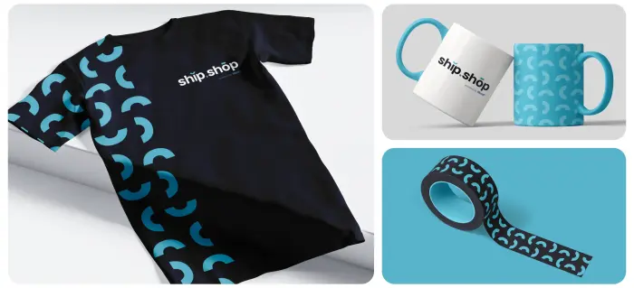
- Branded presentation decks and merchandise to unify brand presence in offline spaces.
Outcome
Ship.Shop now benefits from a cohesive, high-impact brand identity that reinforces trust and professionalism across all markets and channels. The brand now supports:
- Seamless alignment across digital and physical touchpoints — from social ads to courier gear.
- Faster production workflows — thanks to prebuilt templates and reusable elements.
- Enhanced global readiness — through a WCAG-compliant, multilingual-ready system.
- A strong, scalable visual presence that reflects modern expectations — essential for branding for tech startups and global services.
Through this transformation, Ship. Shop didn’t just get a refreshed look. They gained a fully integrated identity platform designed for scale — rooted in modern branding strategy and built for the demands of B2B brand design and high-growth logistics.
This project also serves as a textbook example of how corporate branding services can enable growth through thoughtful, accessible, and scalable design — including a structured brand refresh and targeted rebranding process to align with international business expansion.
.svg)