Website contact form
Few website owners check several fields that visitor fills with contact details. Moreover, the lead form is often the last place on the website that you pay attention to. But no matter how great your website may be, all your future sales depend on this tiny registration form.
Here are 11 tips on website form organisation from Alex, the UX/UI designer of the SOLAR Digital team:
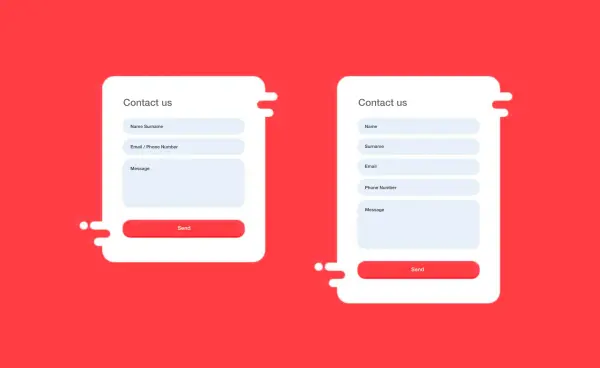
- The number of fields is inversely proportional to your form conversion. The more fields, the lower is the conversion.
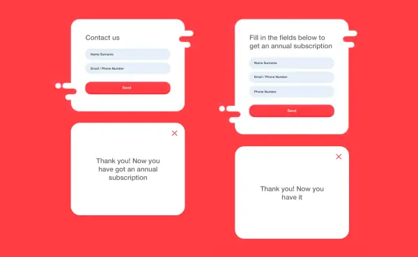
2. The person seeing the form must know why he or she needs to send you the contact details. Some companies forget to explain that, thereby scare people and make them leave the website. People often see the explanation like “Thank you, we will contact you soon” after sending the data. But the potential buyer needs to see it first, to be sure he or she does the right thing.
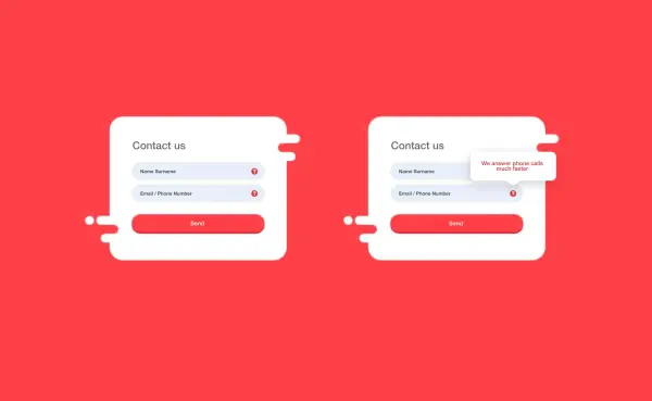
3. Hints are helpful, so use them. Place an icon next to the field explaining what to do and what it will lead to.
4. There are some situations when the form can occupy the entire screen to take the lead’s attention. For example, you can do that when you need to take the user’s E‑mail at any cost. But if you need the newcomer just to subscribe to your news, a simple pop-up will be better.

5. You can collect the database even with a minimal number of fields. Of course, it depends on your website specifics. If you have a bank registration form on your website, it will need a lot of additional data. But for the phone sales, one input field is enough.

6. Be sure to provide validation of the phone/mail data. If it is entered incorrectly, you will not be able to use the data. And the potential buyer will be lost forever.
7. When some of the data is already written in the field (like +44 (7…) in the phone number) that often leads to confusion. And beware of operator code selection in the pop-up list. That action makes data input a little more complicated.
8. Error messages, when typing, should not yell at the user. Let them be just noticeable and show the direction without scaring anyone.
9. Always highlight wrong fields when filling in. The user is more likely to close the window instead of searching for an error all over the screen.
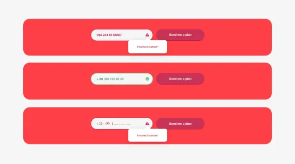
10. Make sure that the form does not delete all data when displaying an error. Because few people in the world have enough patience to fill it out again and again.
11. After submitting the form, inform the user about receiving his data. Otherwise, he will try to resend them. Or even go to a competitor’s website.

- Tired of unneccessary productivity tips? We’ve sorted out the most useful ones for you — Top 100 Productivity Tips
- Whom to pay first: designer or copywriter? — What comes first: design or content?
- AI can’t create suitable web-design. But what if it already does? — How AI has started to impact the work of designers
