Rebranding and corporate identity for a logistics company ITERIS
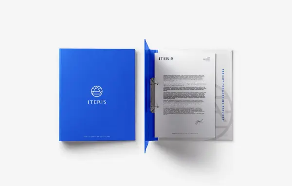
ITERIS organizes international cargo transportation and offers the development and implementation of full-cycle transport and logistics solutions. The previous logotype needed updates.
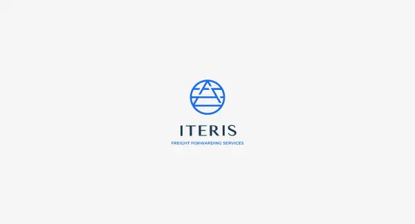
The customer wanted to refresh the logotype and visual of the company slightly. We have been looking for ways to save the appearance of the brand, leave the familiar identification for customers, and make the logo stylish and modern. There were about 20 unique concepts, and the selection process was long enough.
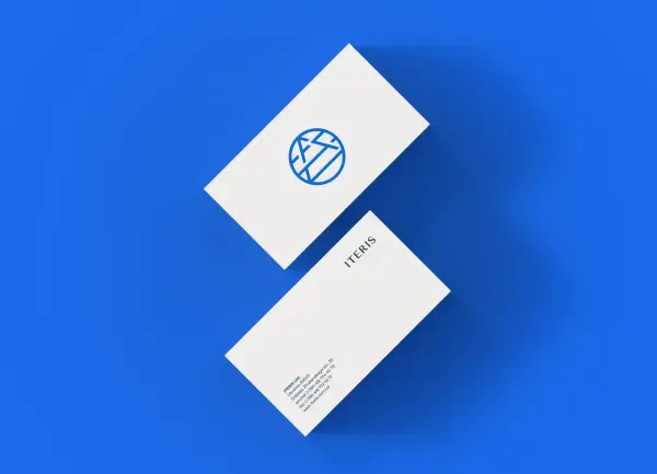
The main tasks on the project were:
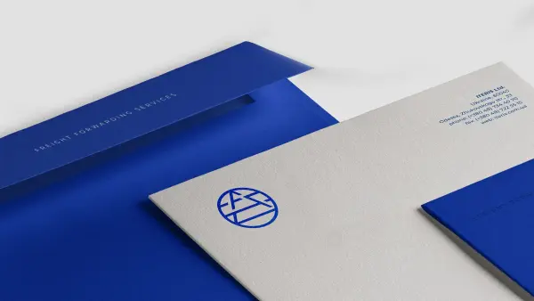
- Change shades, but leave the basic color outline — any variations of blue and white. We chose a deep blue, which is associated with the sea and trust in the company
- Make the logo minimalistic but recognizable by customers
- Save the image of the Earth in the logo. The company carries out transportation worldwide
- Convert the logo’s font style

.svg)


