Design & Development for a worldwide yacht rental service
Sailica’s mission is to solve any needs of yacht enthusiasts within a single online platform. While developing the UX/UI design for an international yachting startup, we combined yacht search and booking in popular regions, a tour catalog, and a thematic magazine into one interface. This comprehensive development of an online yacht tourism service allows users to cover all their sea travel planning needs in one place.
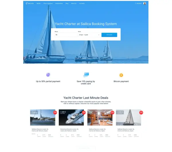
We designed a minimalist interface in which all user actions are reduced to a minimum. When developing this modern UX/UI for a yacht charter service, we placed only the essential fields for quickly searching for a vessel on the first screen. Professional interface development for the charter platform made it possible to seamlessly integrate featured deals, fresh articles, and convenient navigation to the world’s most popular yachting destinations on the homepage.
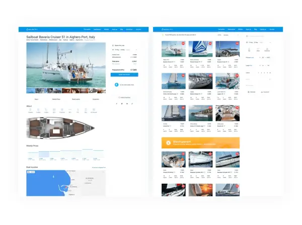
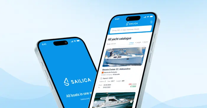
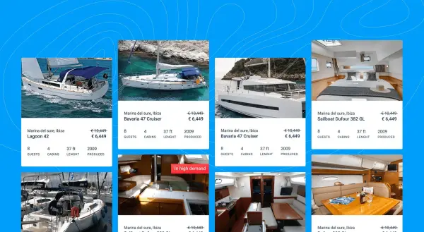
The real challenge was simplifying a massive amount of data. We had to carefully decide what information should be displayed in a concise card and what should be hidden in order to create the perfect UX/UI design for a yacht rental platform. After launching the MVP for the yachting startup, we analyzed user behavior and refined the interface, adding key details that help users quickly choose the right vessel among more than 10,000 options in the database.
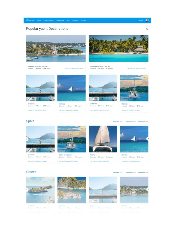
It was a challenge for us to balance brightness and easy navigation on the yacht destinations page. Snow-white yacht in the azure water with the medieval fortress in the background — we wanted to show all that beauty to awaken the spirit of travel in a visitor. However, the scalability and flexibility of the interface should also be considered.
The designers laid themselves out to create a series of author icons. They are minimalist, light, follow the overall design concept, and inform at the same time. We’ve also been thinking out an adaptive version of the site in detail and additionally developing a separate mobile application.




.svg)


